Artist Profile – Tim Maguire

Posted by

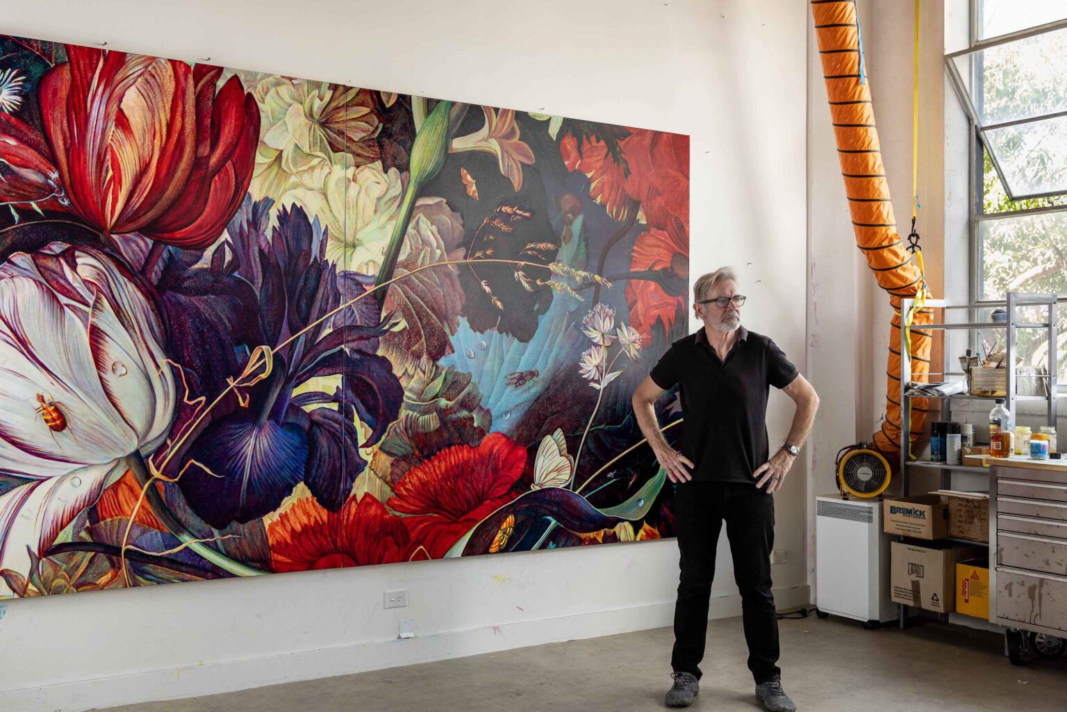
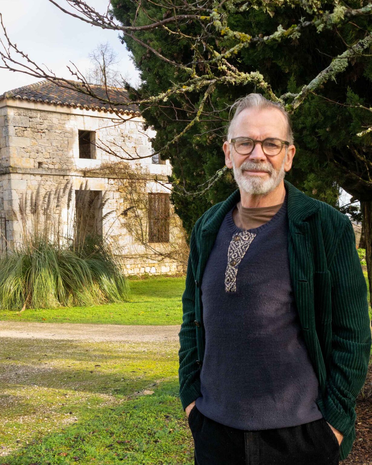
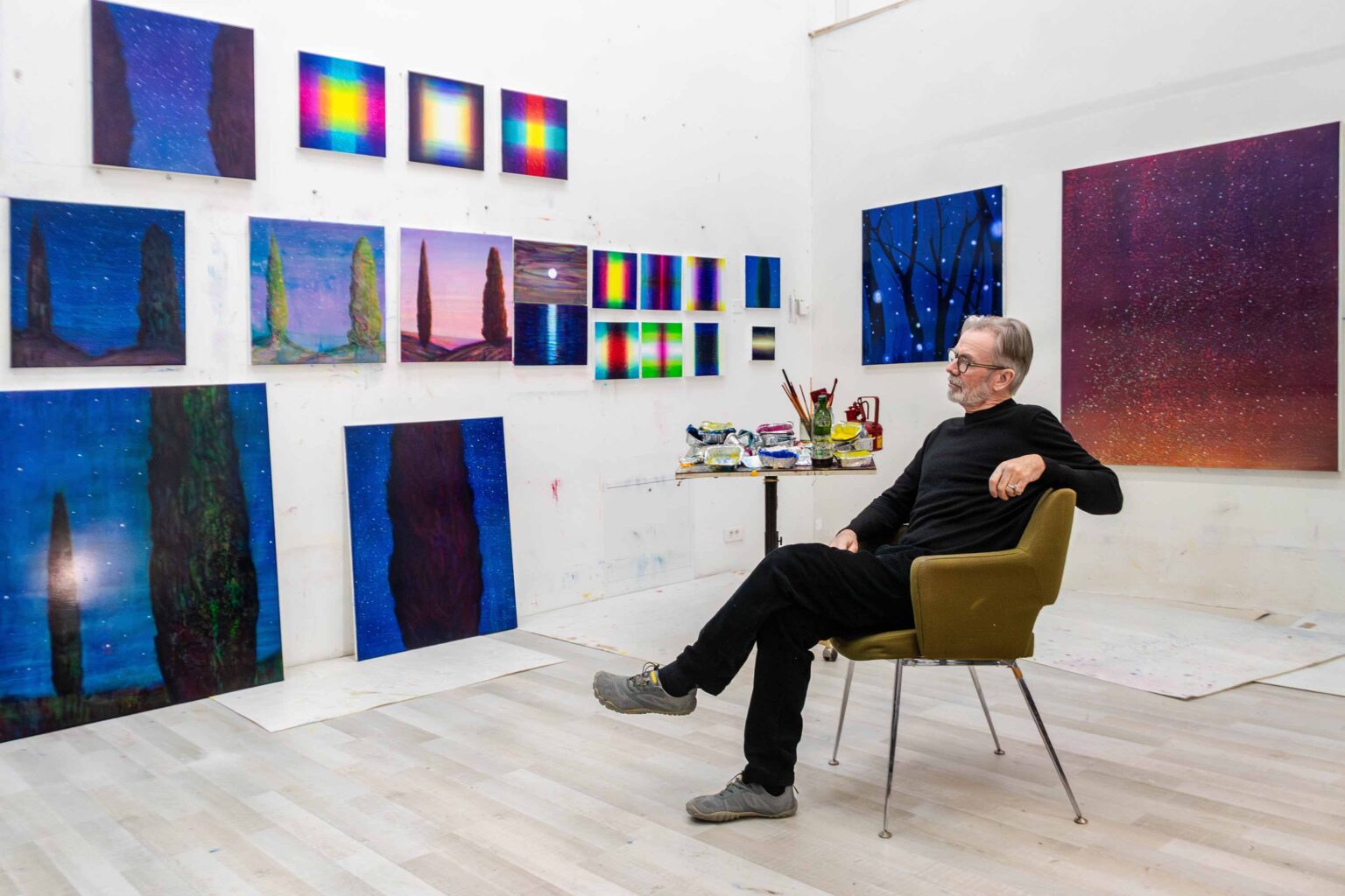
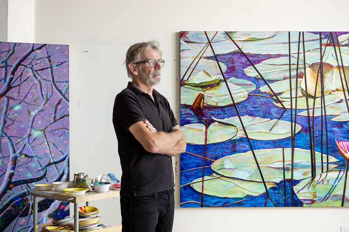
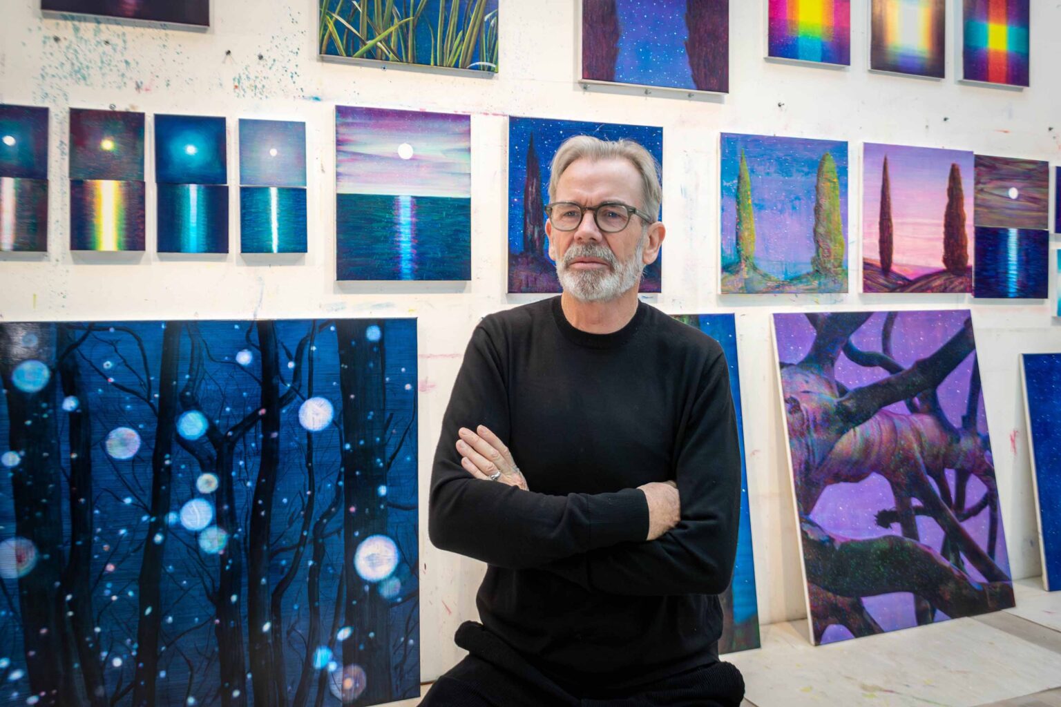
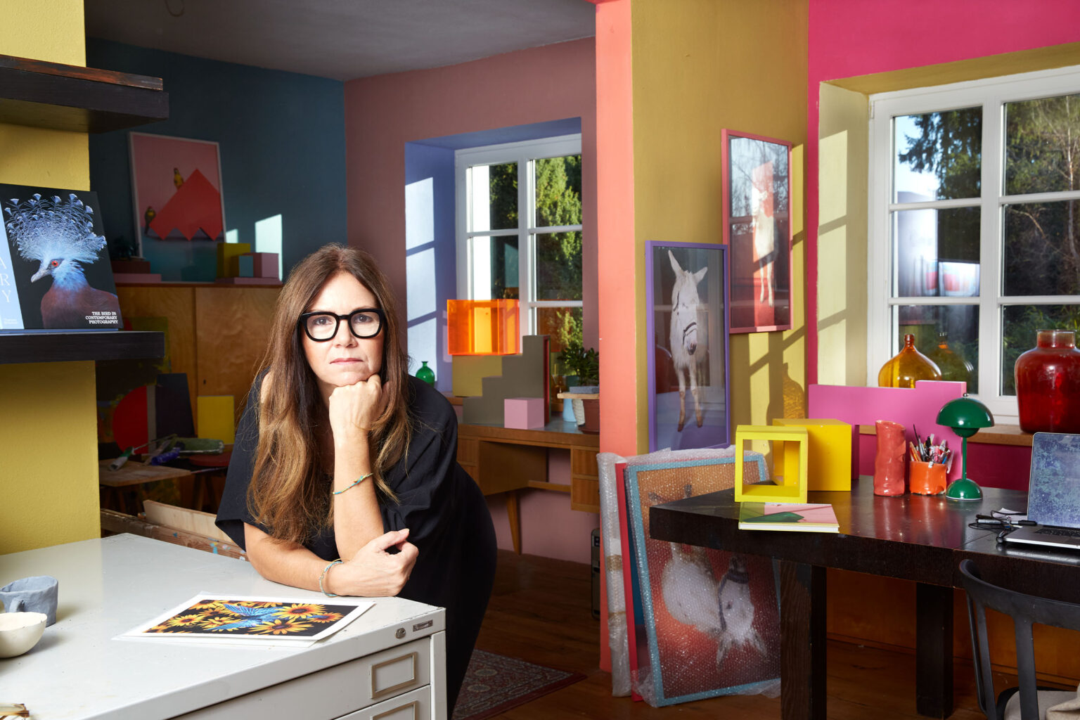
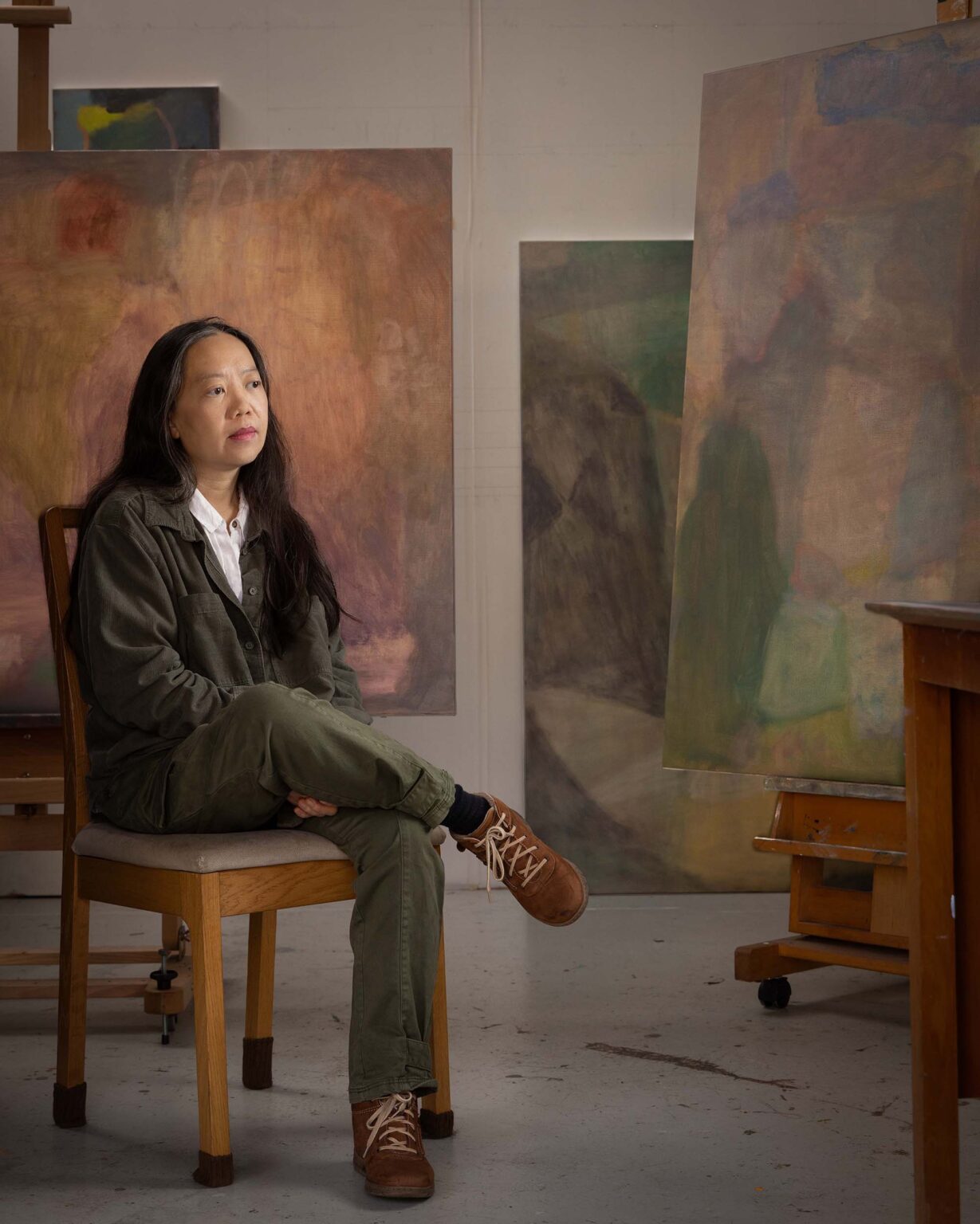
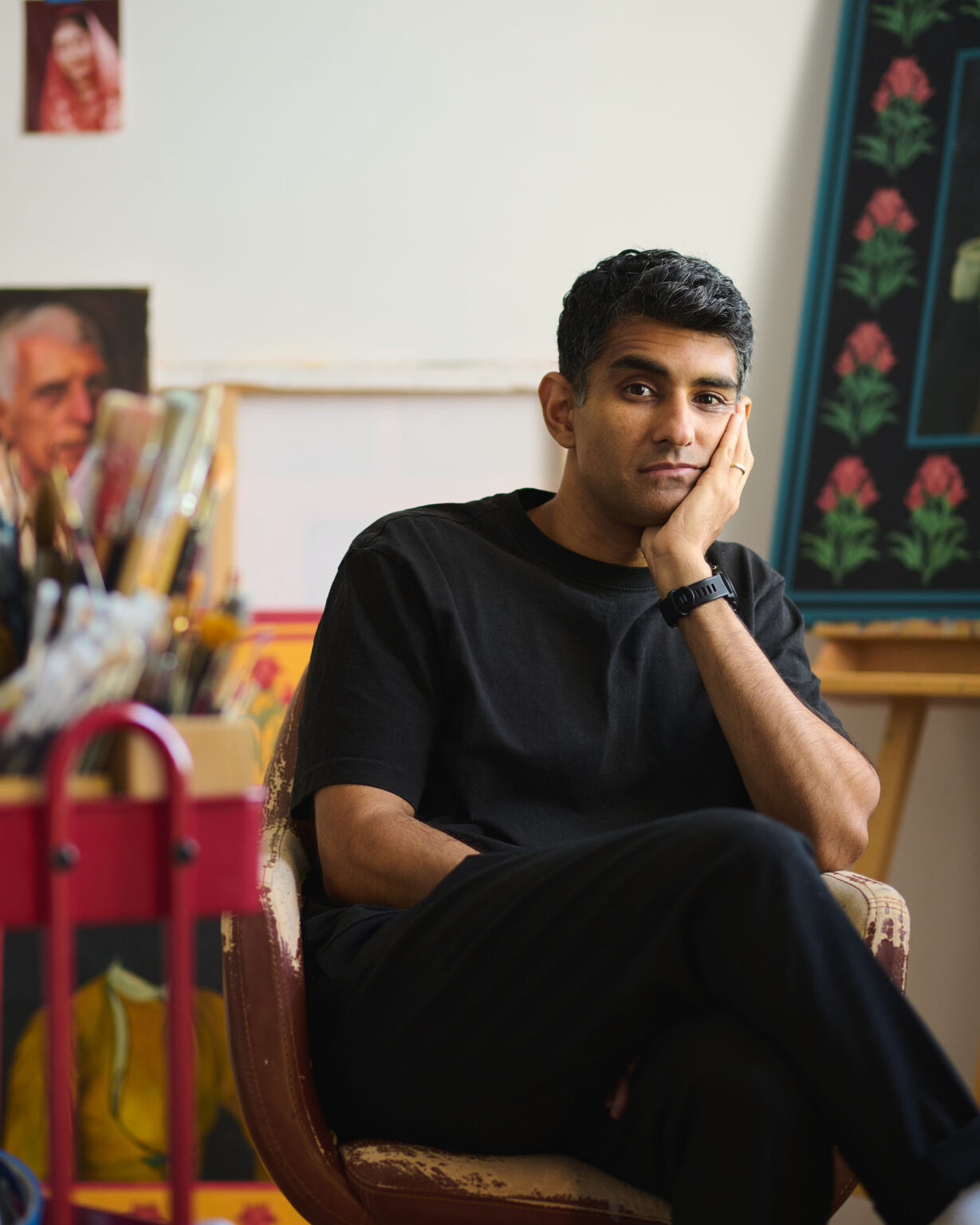
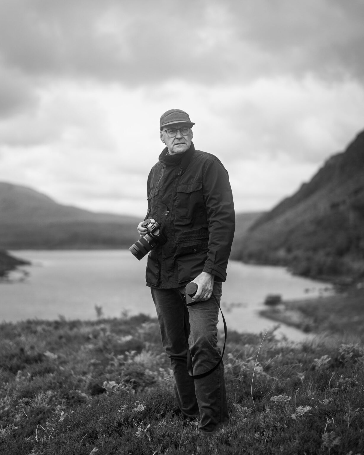
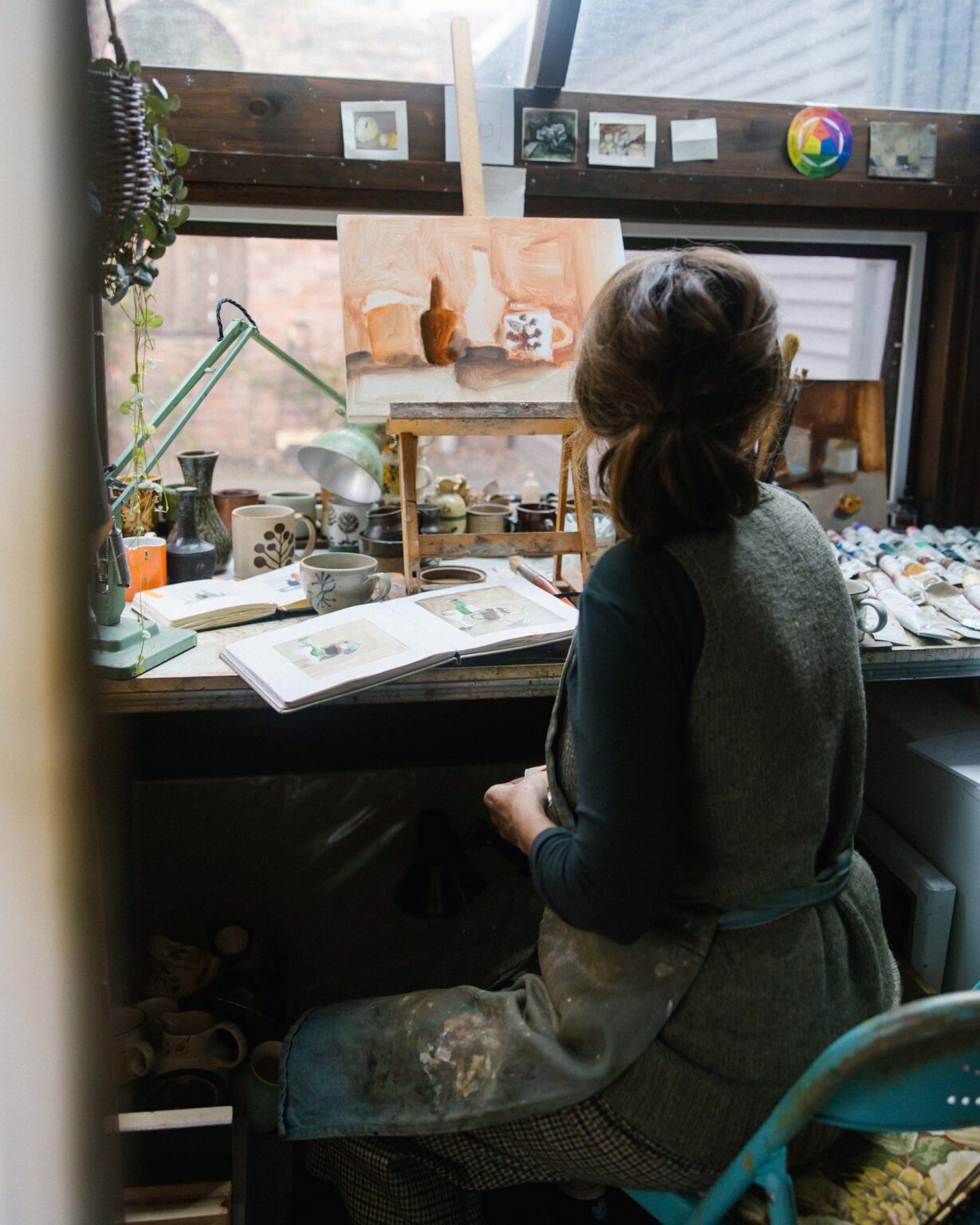
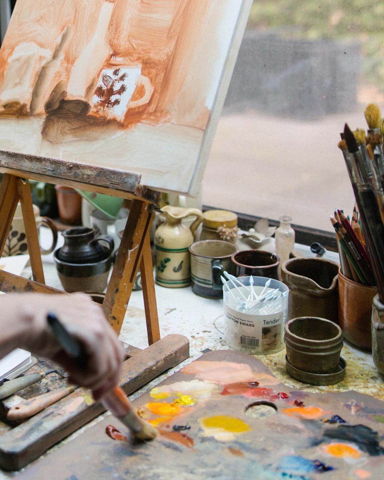
In the lead-up to the announcement of Tim Maguire’s representation by Michael Reid Sydney + Berlin, the gallery team sat down with the artist for a wide-ranging conversation exploring the ideas, processes and optical tensions that have shaped his internationally acclaimed practice across a career spanning close to four decades.

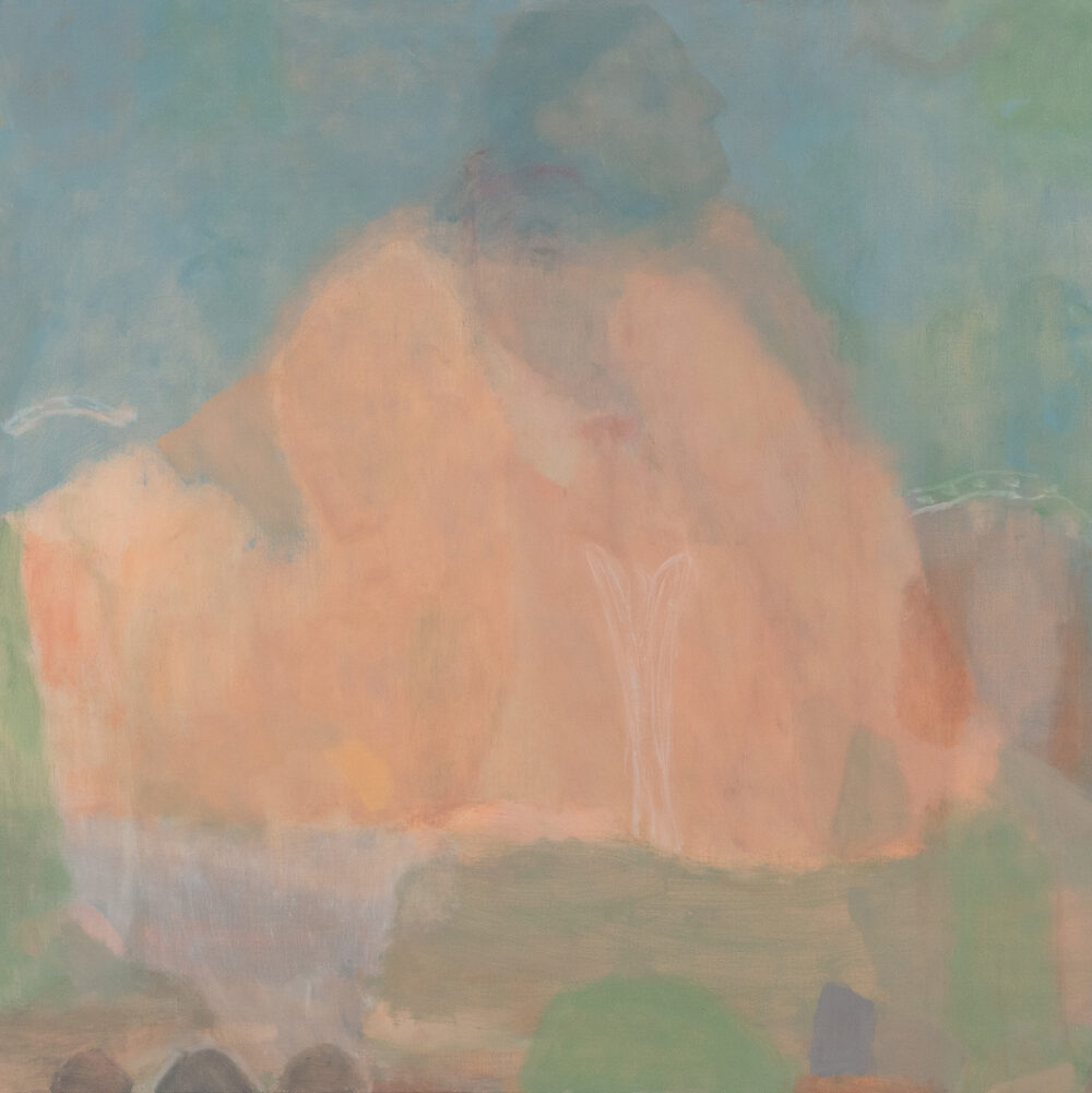
“No matter how naturalistic a painting appears, it’s still just a physical accumulation of paint on a surface – and yet we bring so much to it as viewers,” says Maguire. “I was always trying to make paintings where that tension becomes evident: where you think, ‘This really is just a whole lot of gloopy paint,’ and at the same time, from across the room, it looks like a photograph.”

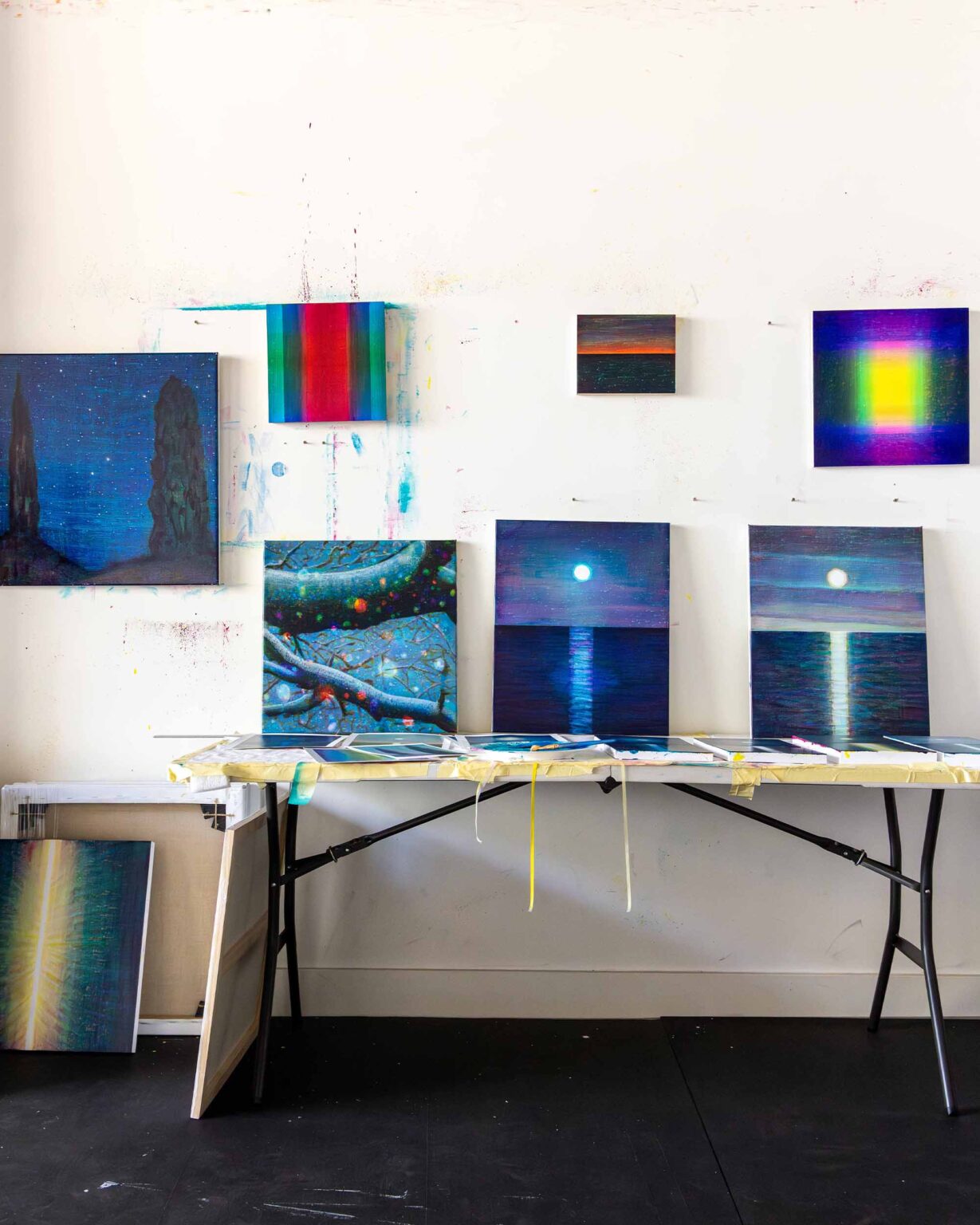
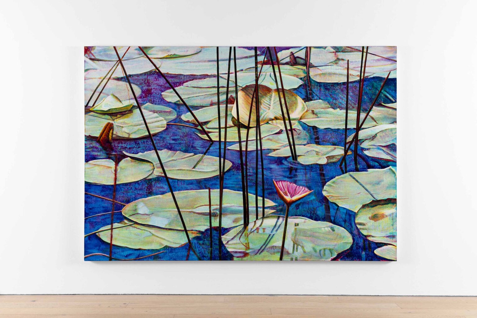
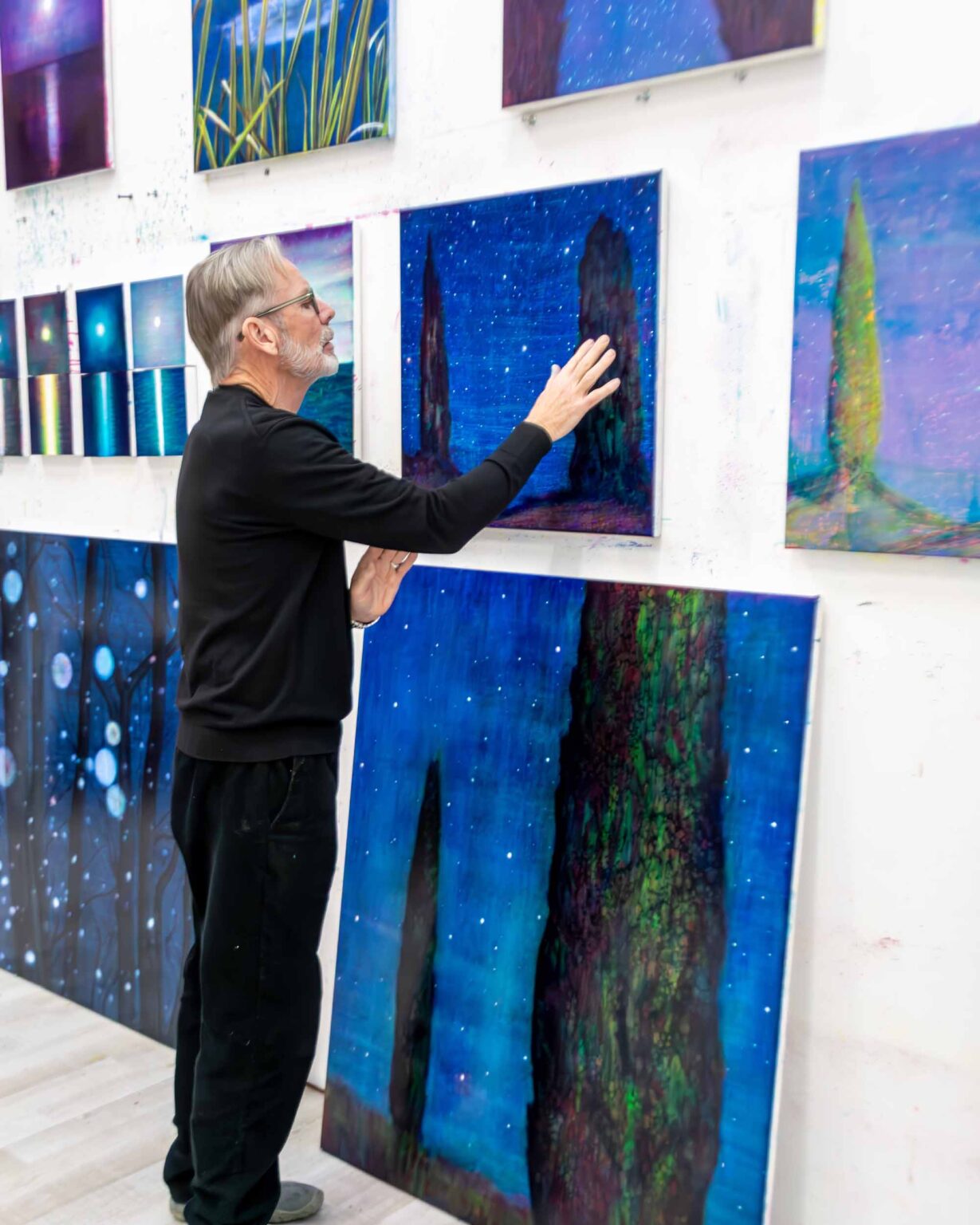
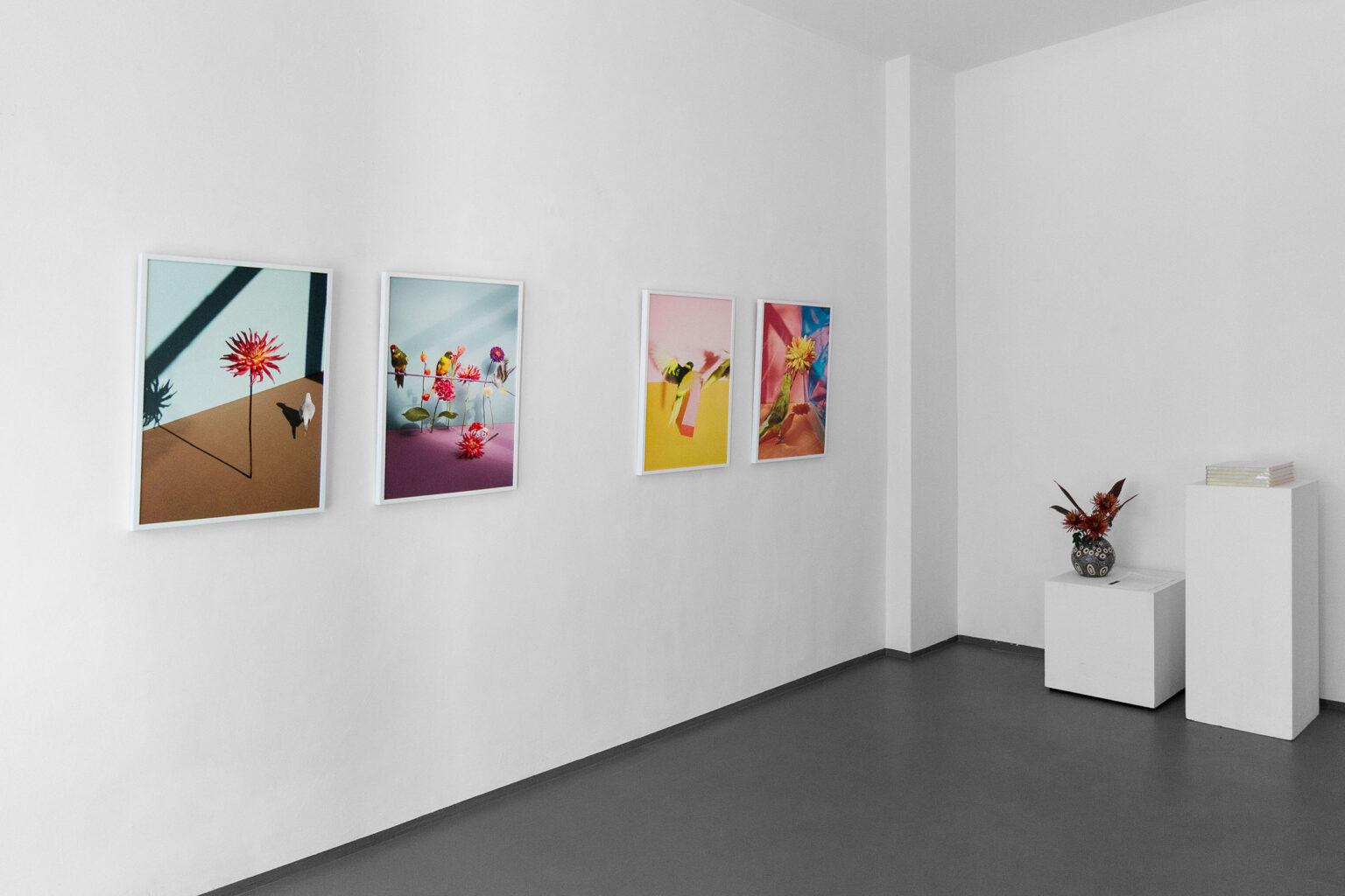
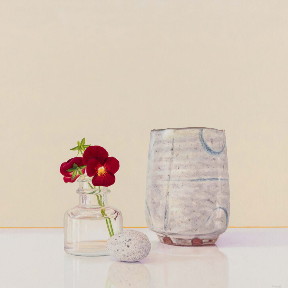
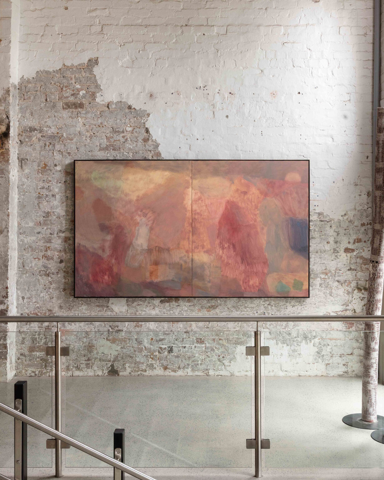
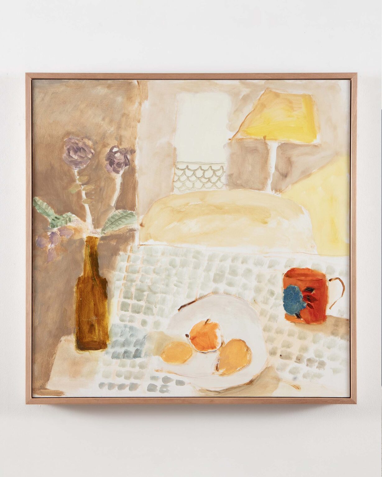
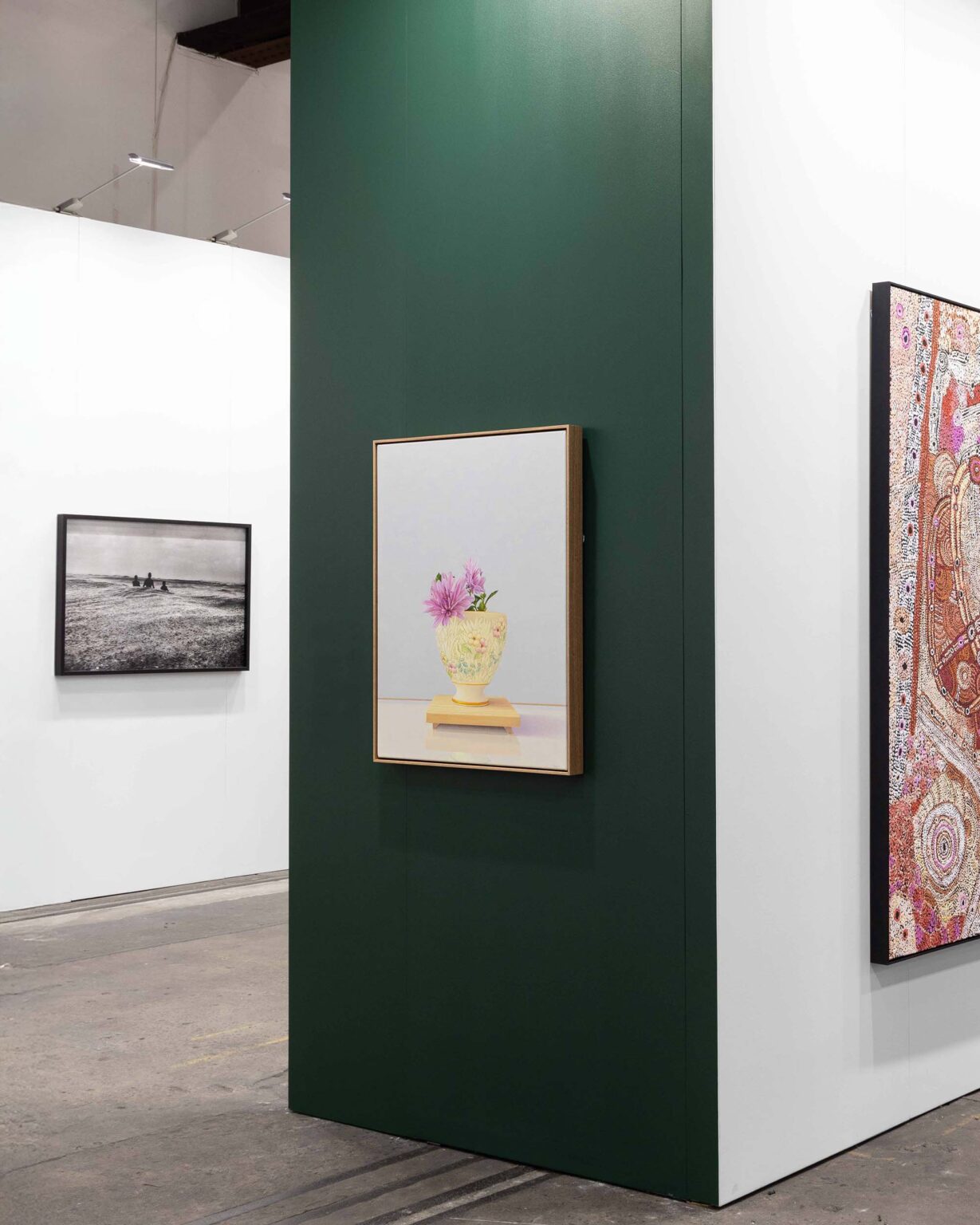
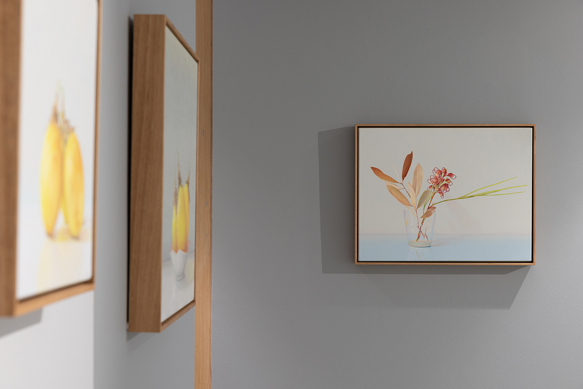
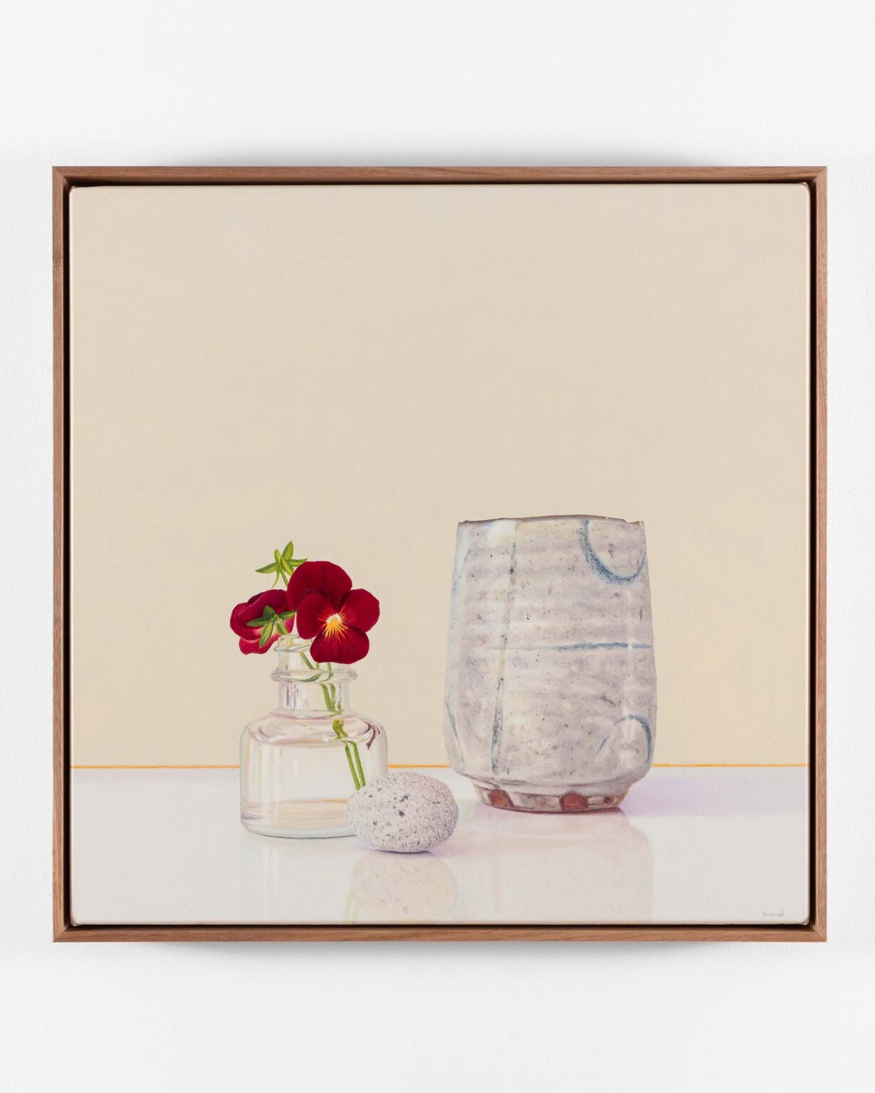
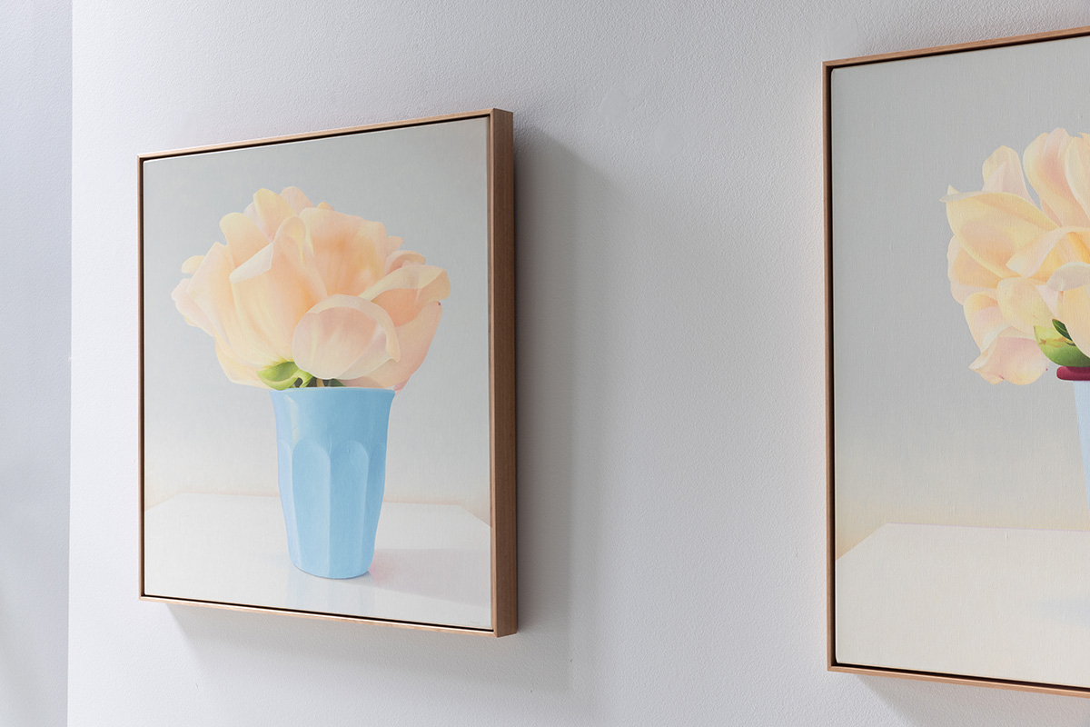
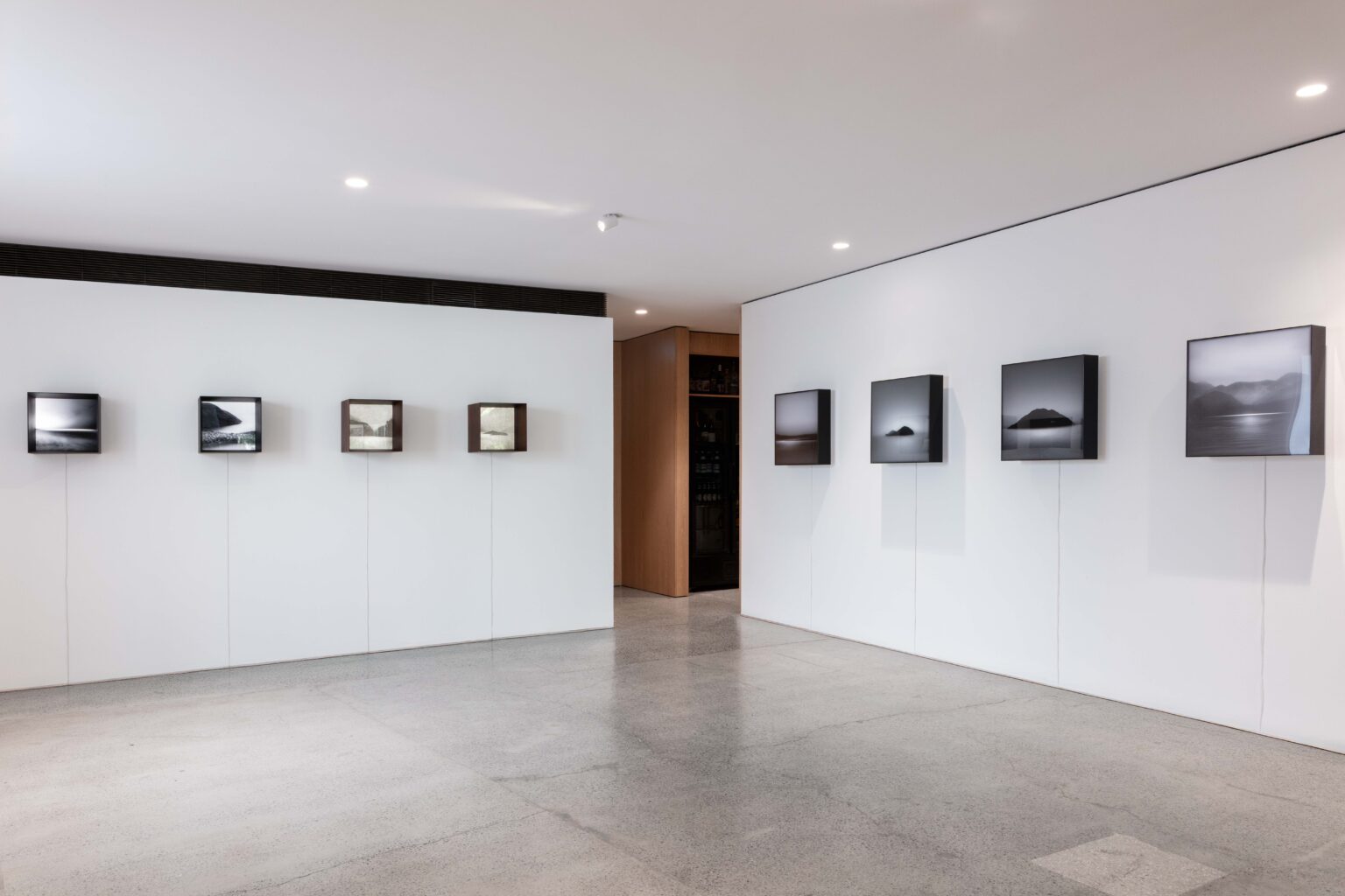
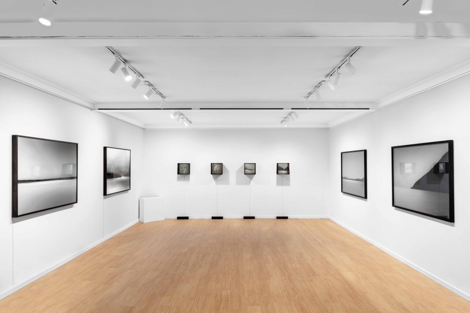
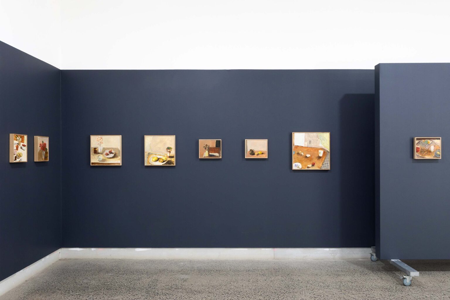
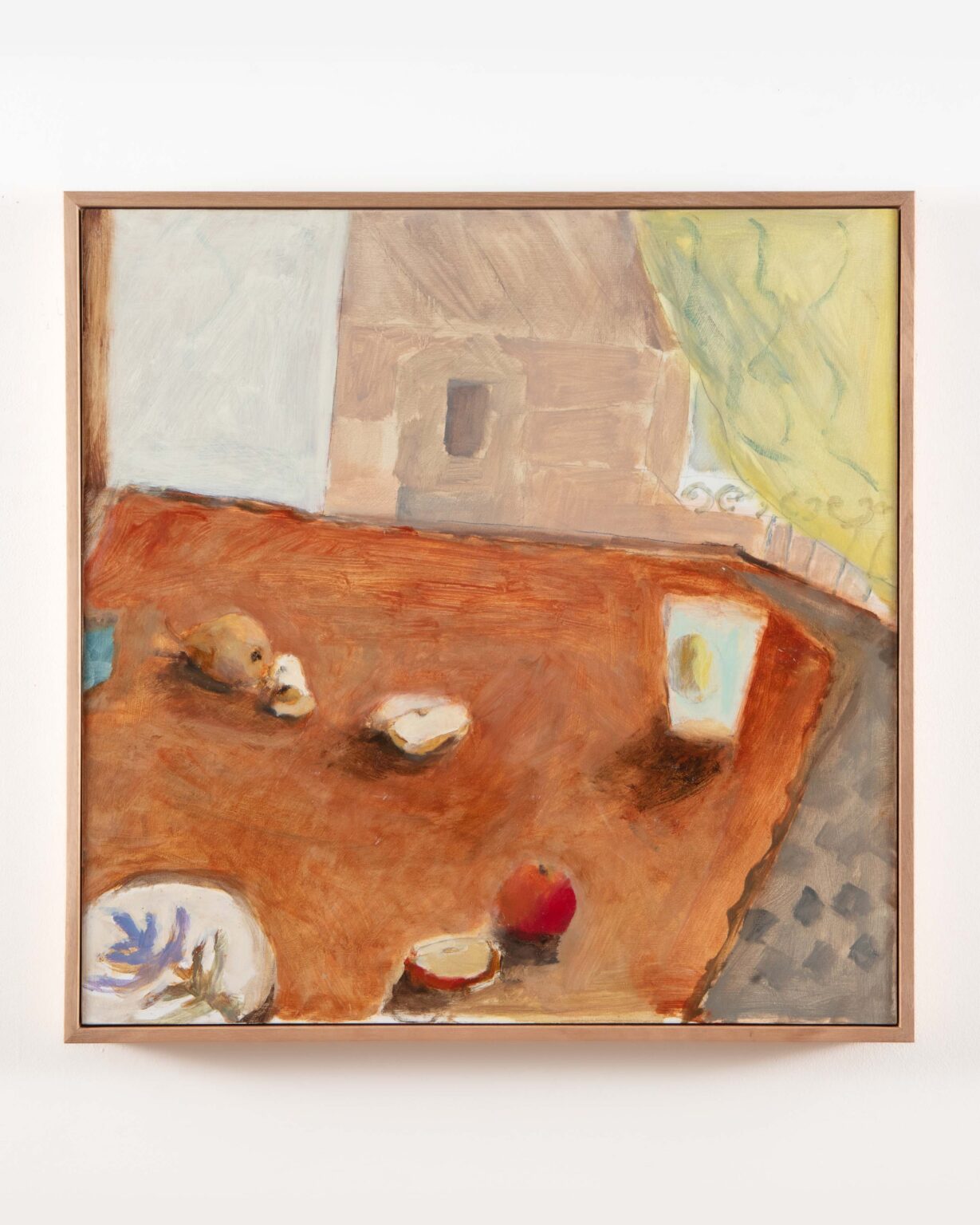
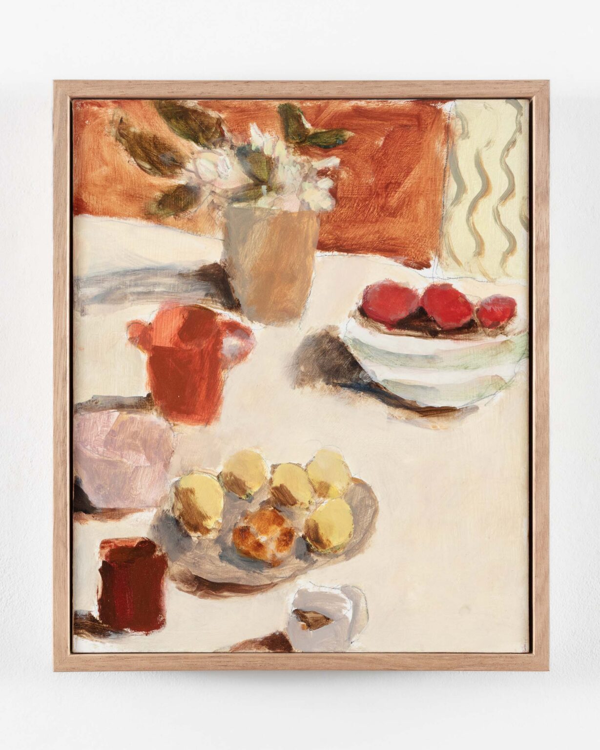
Read the full conversation below alongside a curated selection of recent paintings by the artist, newly available through Michael Reid Sydney + Berlin.

For enquiries, please contact dean@michaelreid.com.au

“There’s a play between the illusion of the image and the physicality of the paint. The ideal painting for me is one where, up close, you see nothing but paint and process and layers, and then, from far enough away, the whole thing resolves into a convincing illusion.”

TIM MAGUIRE

___

Your practice has encompassed various mediums across your career. How do you approach these distinct facets of your practice – painting, printmaking and photo-based work – and how has moving between different fields become embedded within your painting process and shaped your broader thinking about image-making?

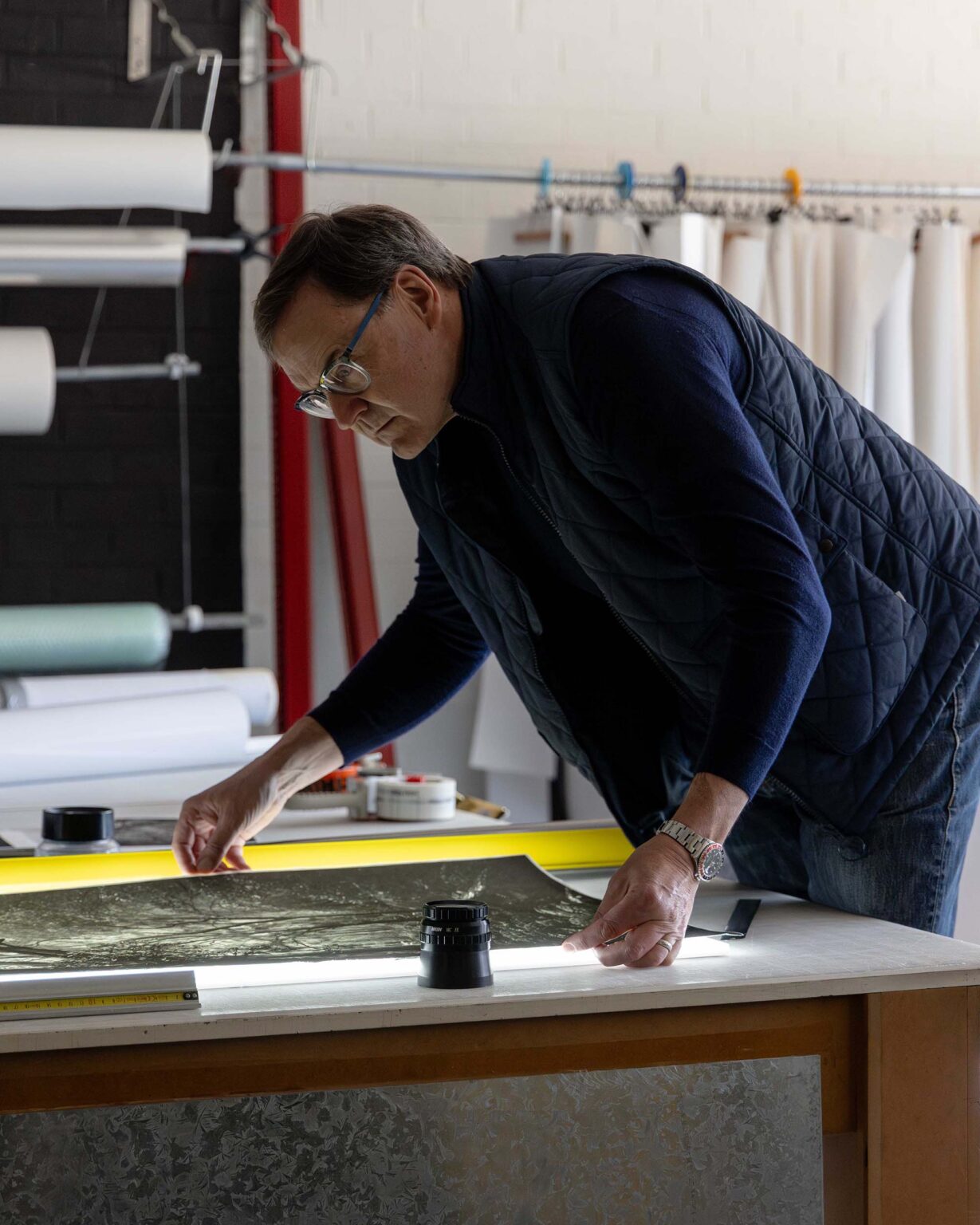
I’m primarily known as a painter, but I see printmaking as being of equal importance in my practice. That’s not necessarily represented in the way my work is seen, because there aren’t always the same opportunities to show the prints. But I do make a lot of prints, so it’s an ongoing practice.

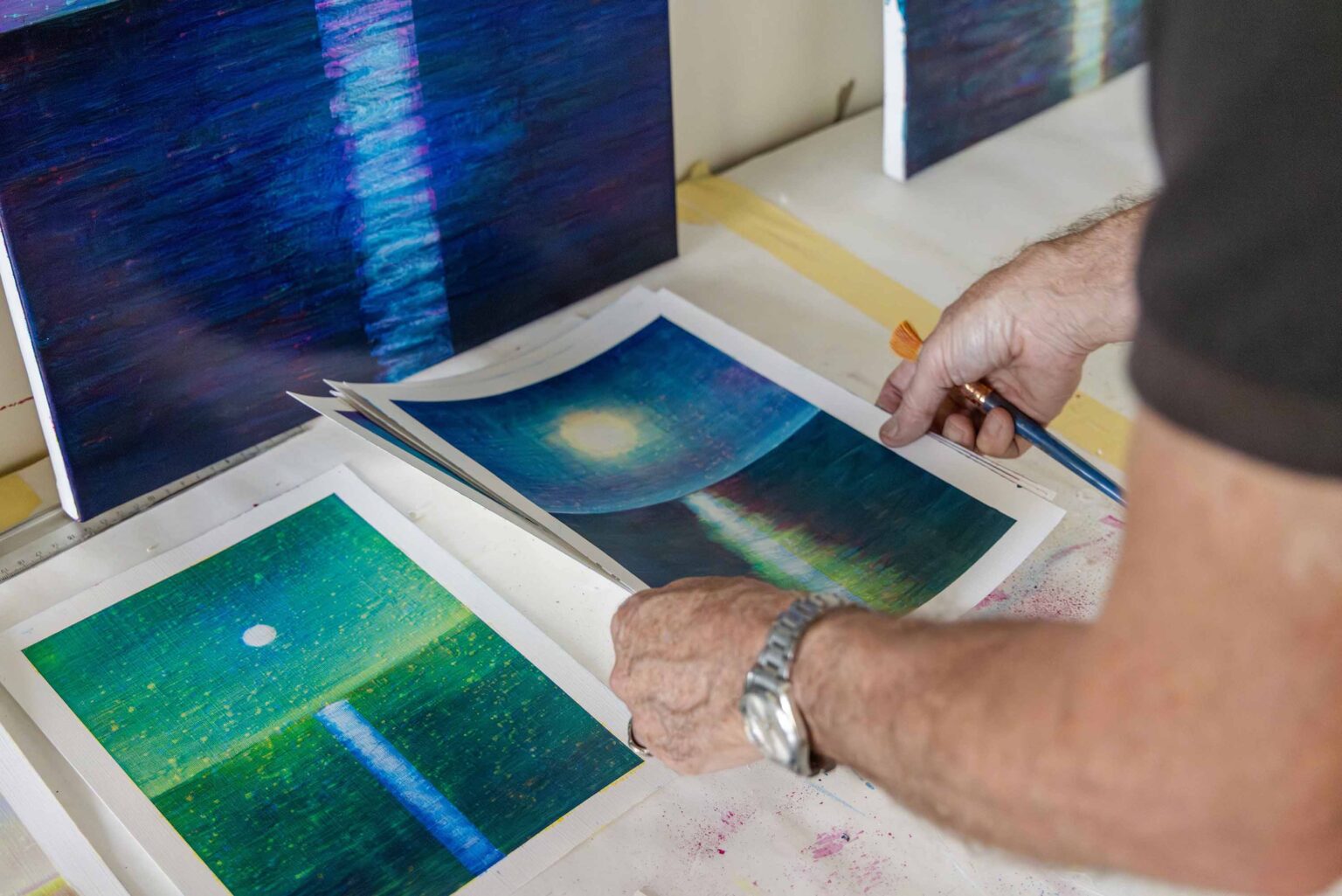
It started in 1987, probably. I’d already begun exhibiting – my first solo show was in ’84 – but it was a kind of revelatory moment. I found myself working with a master printer who explained that you could build up colour through discrete layers of primary colour – yellow, red, blue, black – and that you could achieve a full spectrum through those few colours. The idea of working with transparent inks on white paper, and allowing the whiteness of the paper to illuminate the image and create luminosity, was a revelation.

I made a few prints with the Australian Print Workshop in those early days, but I also took those printmaking ideas back into the studio. I started thinking, can I make paintings in the same way? That’s when I began working with transparent colour – not so much in strict layers, but using transparency and the whiteness of the canvas to illuminate the image. Thin glazes and transparent pigments came directly out of printmaking.

It was only some years later, when I stumbled across a process of splashing solvent into the colour layers to remove parts of each layer in a fairly random dot pattern, that I realised I could emulate the quality of pure points of colour sitting side by side. That led to my colour separation paintings – which, of course, is a printmaking term.

Could you tell us about the colour-separation process – how has it developed across different bodies of work?

When I got to the point where I realised I could actually do it, the splashing of the solvent was a key component and quite random. I wanted each layer of colour to remain visible as an independent entity – to reveal the process itself. It was about the idea that you could make an image by pulling it apart and putting it back together again.

To do that, I needed to work quickly. It might be a four- or five-hour painting session, then splashing the solvent while the paint was still wet enough to react, but dry enough not to collapse into a mess. Timing was everything. I liked the idea that the image was brought together through a mechanical process largely determined by chance – how much solvent comes off the brush, how dry the paint is. The image comes together almost magically, which, for me, was one of the great attractions of printmaking.

Later I realised – particularly after a series of massive paintings in 2000 – that this approach had limits. Those works were about two-and-a-half metres by six metres, and I ended up needing serious physiotherapy. So I slowed down. It wasn’t essential to do everything in one session, and that allowed for more control. There’s a desire to master the challenges you set for yourself, and eventually you do.

In this process, any colour might be a combination of yellow, magenta and cyan. Gauging that while applying it is almost impossible. Often it’s only when you apply the third colour that you realise you’ve gone wrong with the first two. Those pitfalls are what keep it interesting. I’ve got to the point now where I’m pretty good at navigating them, so maybe it’s time to do something else.  The last two shows I did were very ambitious, large diptychs. I could never have done those 25 years ago. It felt like the end of something.

You spoke about holding the image in a state of becoming – the work being less about representation and more about ‘imageness’ in a slightly dispassionate way.

For sure. It was coming out of postmodernism, and the idea that images were floating around – you could grab one from here, one from there – like slides on a screen, which is how we learned about art back then.

I was trying to make paintings that looked like that. They were flat, transparent, with no tactile physicality. The paint was a very thin veil – almost like a luminous projected image, closer to a cinema screen than a physical object. The images could be anything. The weirder the colour combinations, the better. I moved between representational and abstract things, and the common denominator was process.

There is a physicality to the way your paintings are experienced – both in their monumental scale and in the way a picture might cohere at a distance or dissolve into abstraction up close. How do you consider scale in the making of a work?

That transformation is really important. I always thought the great thing about large-scale works was that you could be incredibly loose at the coalface, and yet, if the viewer stepped back far enough, the image could come together.

There’s a play between the illusion of the image and the physicality of the paint. The ideal painting for me is one where, up close, you see nothing but paint and process and layers, and then, from far enough away, the whole thing resolves into a convincing illusion.

Ideally, the viewer is like a rubber band – moving back and forth between those two states. For me, that tension is the magic of painting. No matter how naturalistic a painting appears, it’s still just a physical accumulation of paint on a surface – and yet we bring so much to it as viewers.

So I was always trying to make paintings where that became evident: where you think, “This really is just a whole lot of gloopy paint,” and at the same time, from across the room, it looks like a photograph.

That sense of scale – of cropping and extrapolating source imagery into something cinematic – also transforms the subject. How do you think about beauty in your work, particularly when it’s pushed to extremes?

It’s tricky, because even to say your own paintings are beautiful sounds vain or arrogant. For a long time there was an idea that aspiring to beauty was philosophically flawed – that it smacked of elitism or privilege – so it’s hard not to have an ambivalent relationship with it. But if I look across my work, the aesthetic quality has always been a strong driver. It’s about creating an image that holds your gaze long enough for it to start working on you. You begin to see it differently.

We’ve all had the experience of hearing a song for the first time and feeling nothing, then loving it the fiftieth time. That’s hard to achieve with painting. We’re less and less trained to spend time with images now. So beauty can be a way of slowing the viewing process.

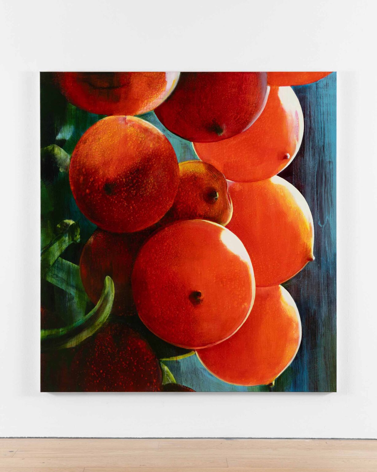
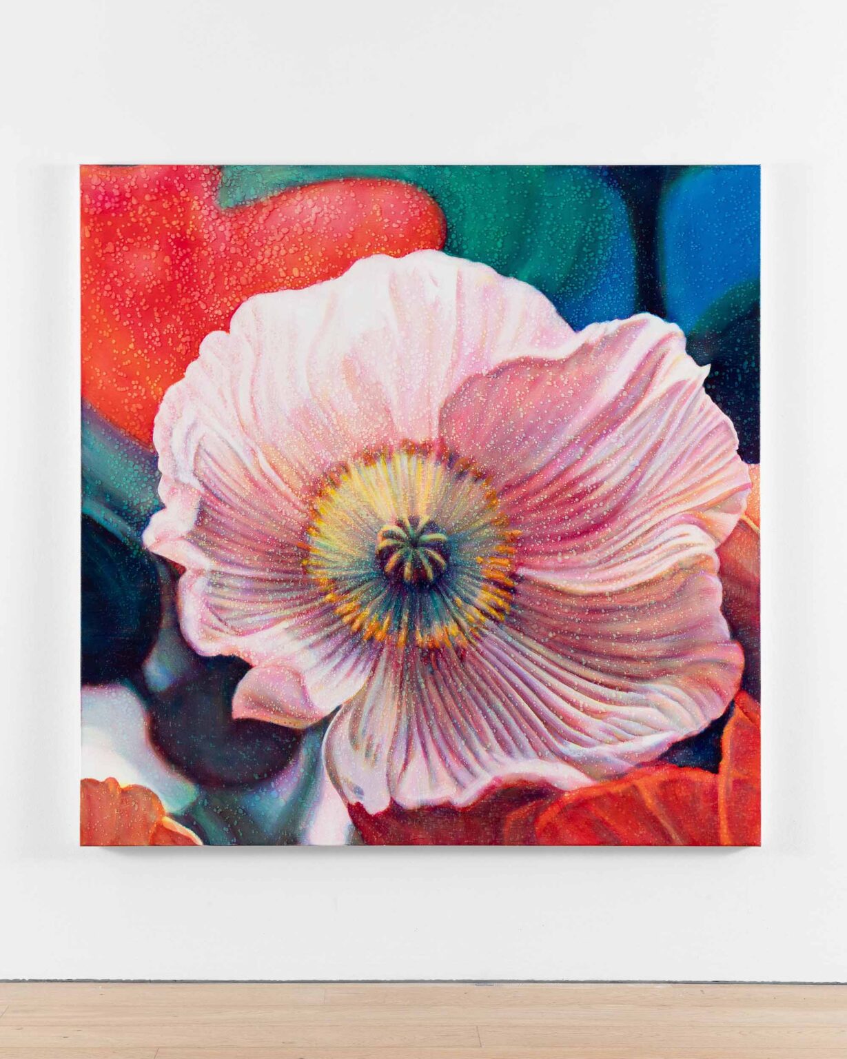
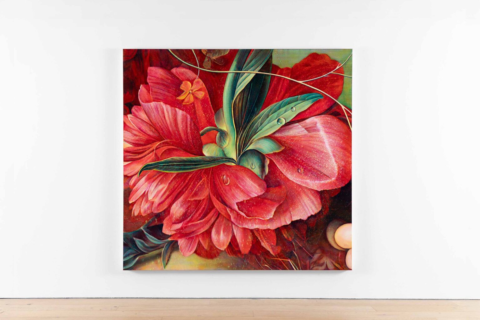
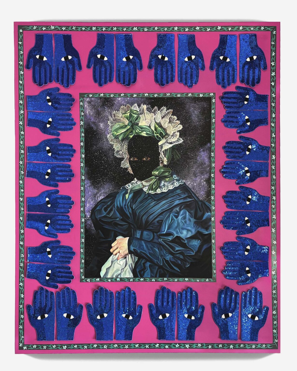
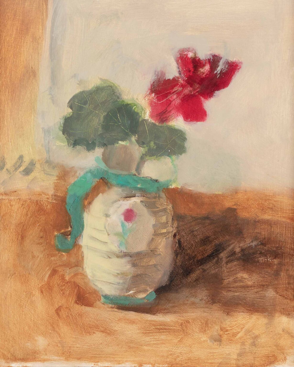
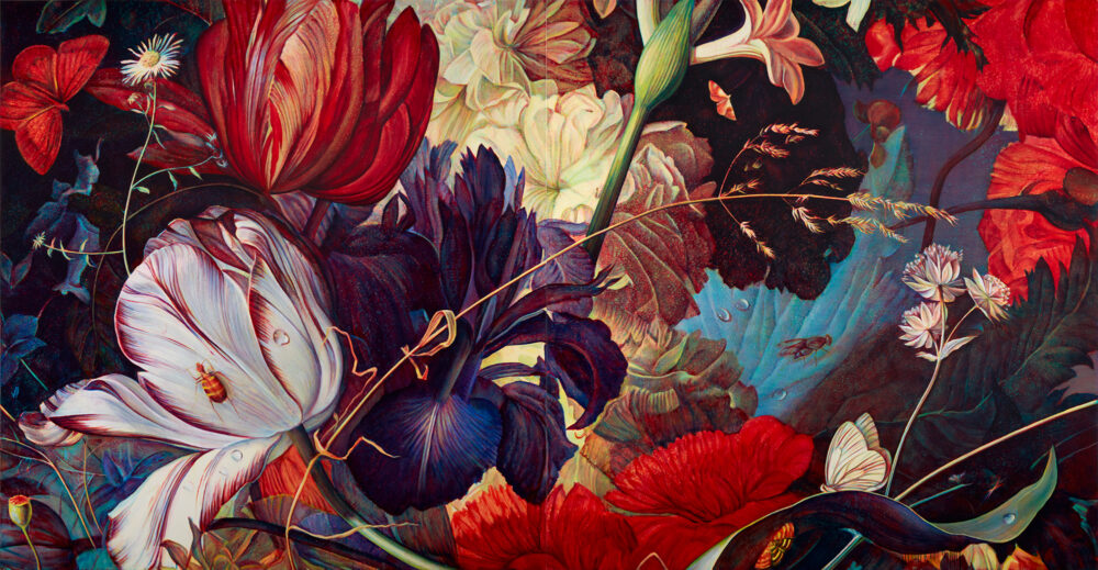
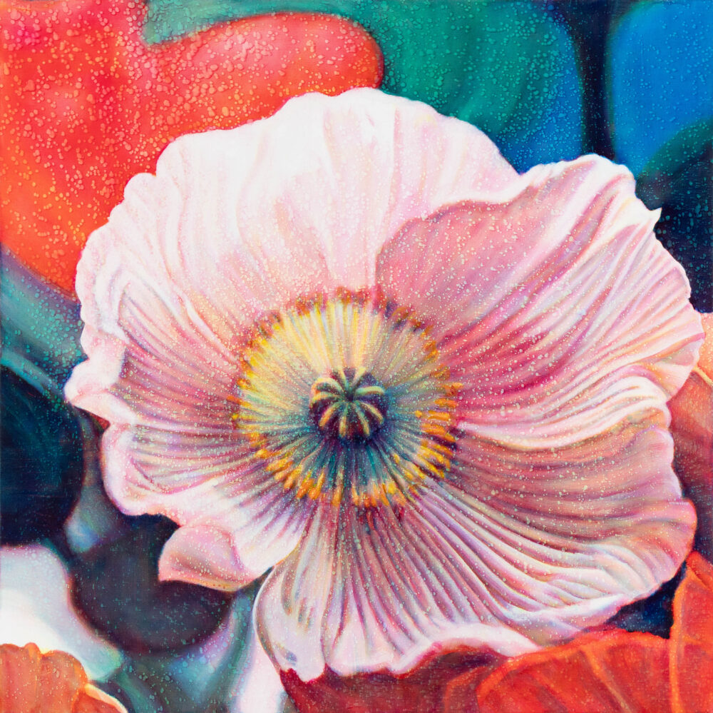
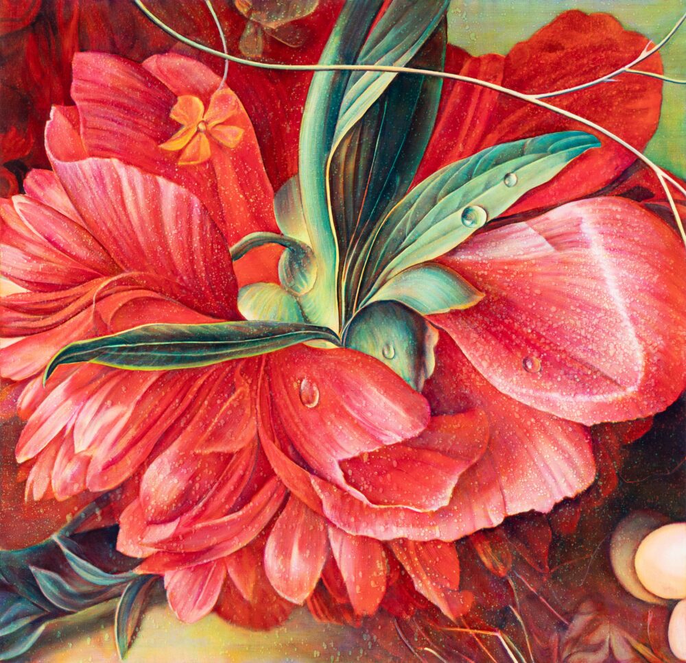
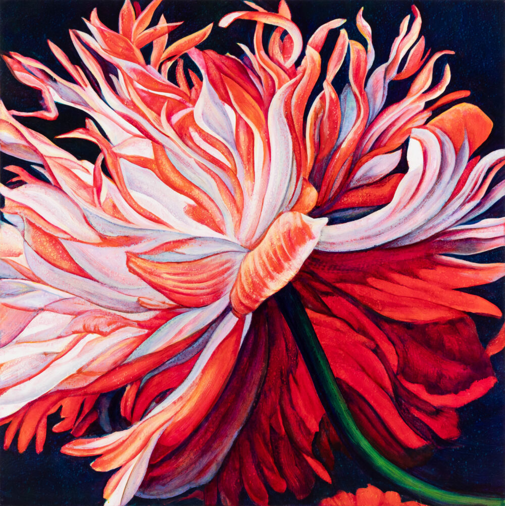
Flowers were annoying in that sense, because everyone assumes flowers are beautiful. I wasn’t interested in prettiness. What interested me was the tradition – the philosophy behind Dutch still lifes, mortality, fleetingness. You could also zoom into a flower and find forms that were almost abstract – curves and dramas you wouldn’t find in a portrait or landscape. They had no top or bottom. They had the vigour and thrust of something like a Delacroix – writhing, energetic. Yes, they were flowers, but that wasn’t really the point.

I don’t really think about beauty per se. I see something in the world and think, I’d like to photograph that. Then I see something in the photograph that makes me think it could become a painting. Sometimes you get nothing. Sometimes you get something unexpected, and that can open up a whole new series.

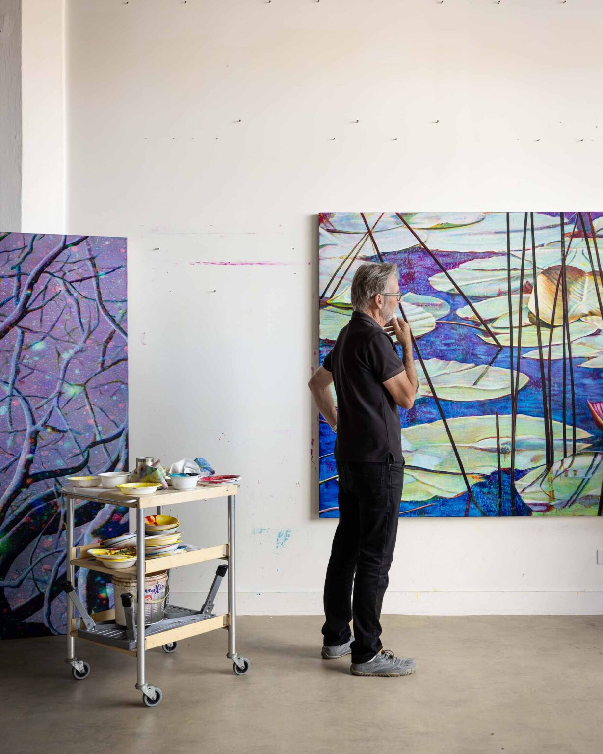
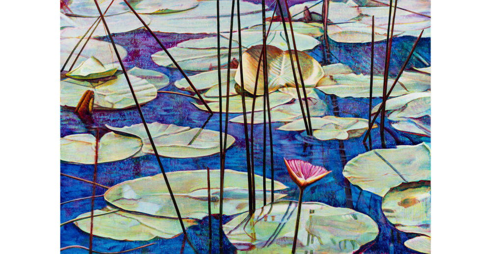
One of the big things in my work is the relationship between the abstract and the illusionistic. Monet’s water lilies are a good example. They’re almost abstract, but there’s a sense of space that’s both perspectival and flat. You never see the horizon. That contradiction is what painting is. You read space, but the surface is flat. Two contradictory things at once. It’s like life. There’s no logic to it.

Your career has unfolded alongside a broader shift from analogue to digital. How has that transition influenced your thinking about images and surfaces?

Even early on, if I was taking a detail from a Dutch still life, it was already an image that had passed through multiple stages. By the time I found it, the painting was 300 years old. It had been photographed, reproduced in a book, sat around for decades, then scanned – and from that fragment I was making this huge painting.

The idea of moving from analogue to digital and back to analogue – the oil painting – felt very comfortable. The same applied to photographing, manipulating images digitally, printing them out, then using them as the basis for paintings or lightboxes.
If I painted the same image three times as colour separations, they would all end up different; I’d never make two the same.

Around that time, digital photography was emerging. I went to New York and came back with a Kodak digital camera. Early digital images had strange effects – colour fringes, glitches – which I found fascinating. The question became how to translate that into painting. That’s where colour separation came in.

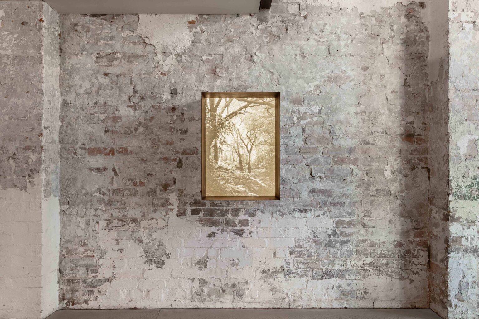
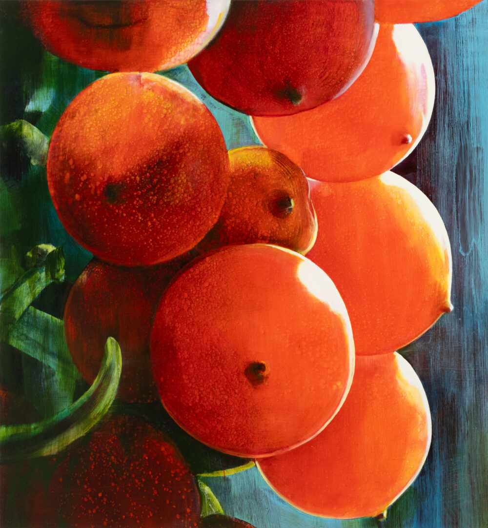
It creates a glowing quality. With opaque paint, light bounces off the surface. With transparent pigment, light passes through, hits the white canvas, and comes back out – like stained glass. So it might look like a painting of a flower, but really it’s a painting of a photograph of a flower. There was always a distance between me and the so-called subject.

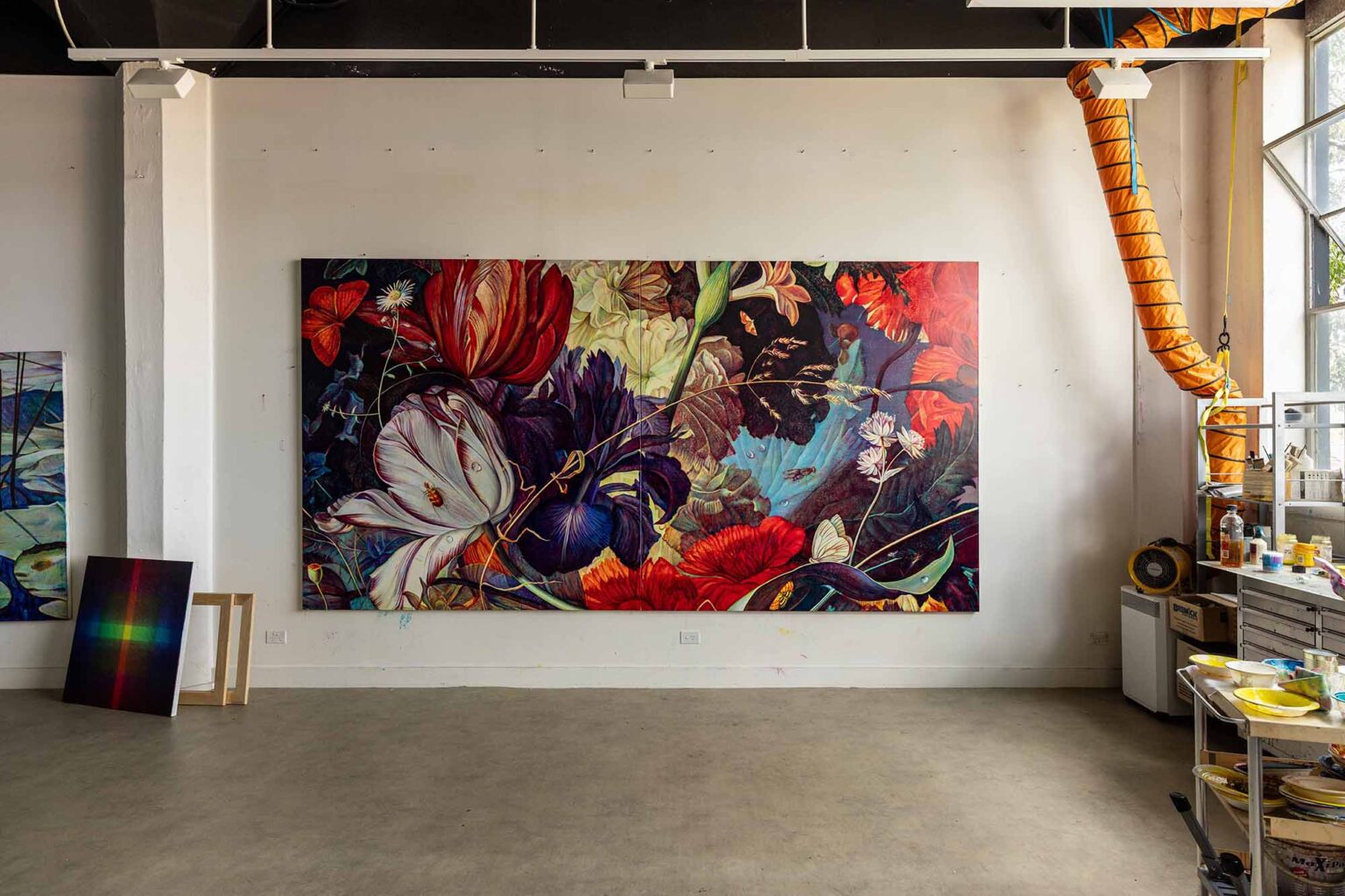
With recent series such as Small Worlds and Lost and Found, you returned to Dutch floral still lifes as source material. What prompted that return?

That was partly about accessibility. In the early 1990s, I was working from postcards or the occasional book. Now museums have incredibly high-resolution images you can zoom into endlessly. Suddenly there was all this material available, and I had the technical capacity to deal with it.

Earlier, I liked not knowing what I was painting. The fuzzy postcard freed me up. It was just shapes and marks. I didn’t know if it was a leaf or background, and I liked not knowing. Now it’s very clear what it is, and I’m interested in it. I really enjoyed painting the little bugs and strange minutiae that had been scrupulously recorded 400 years ago.

These series seem to involve a more explicit engagement with the symbolic allegorical aspects of Dutch still-life tradition. Do you feel there was a shift? And what felt newly available to you in drawing out those narrative layers?

I don’t know if it’s maturity, but I stopped denying the source. For a long time I talked about the work as being about process. Now the process is a given.

There’s a paradox in Dutch still lifes. They were moral reminders of mortality – a reminder that beauty fades and you end up a skull. At the same time, these paintings have been preserved for hundreds of years. They’re frozen under varnish. They’re about life and its fleetingness, but they’re also kind of dead. I was trying to make loose impressions – bigger, more fluid – to almost revivify them. To release them.

There had also been terrible bushfires just prior, and that was all happening around the time of COVID; this idea that tiny viral agents could turn everything on its head. Bushfires have been a theme in my work for a long time. They’re illustrations of the fleeting, unreliable nature of existence.

Beauty is subject to those forces. Nothing is timeless or universal. There’s a resonance between those ideas and what underpinned Dutch still lifes originally. So I was happy to re-dock my boat there, with more attention.

This openness to narrative feels especially present in bodies of work such as Old World, New World and Regeneration, which responded to the Kinglake bushfires. How did those works take shape?

Bushfires had been part of my thinking since art school. I grew up in the Blue Mountains – they were an ever-present danger. You felt safe, but the wilderness was always there. I made early works about that contrast – everyday life set against an underlying threat. A barbecue in an empty space, sausages frying, bushfire smoke on the horizon.

After the Kinglake fires, I took panoramas of the burnt landscape. The twisted branches looked almost nuclear, but in the foreground there was vivid green regrowth. That energy of renewal after such ferocity was incredibly striking. That became the source material for the Kinglake works images – mainly large prints and light boxes, though I’ve also made some paintings from it.

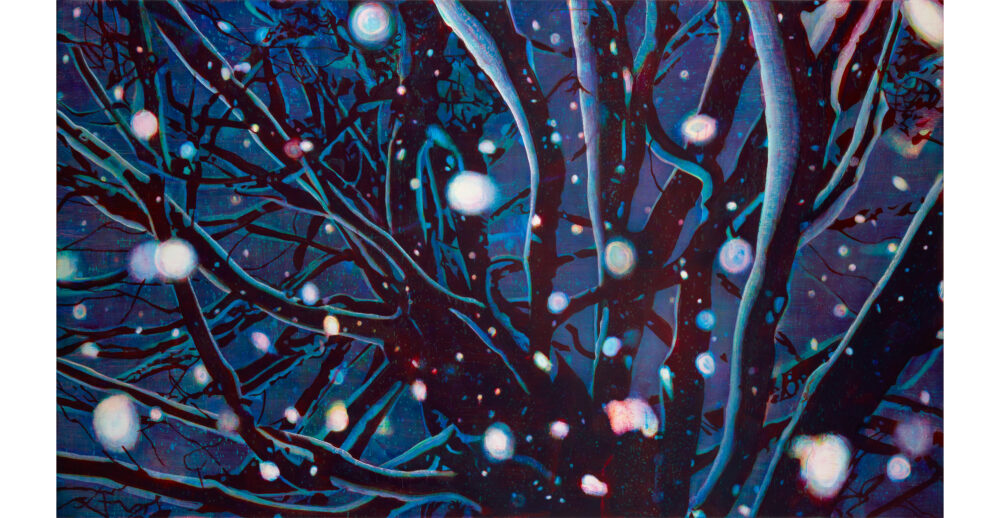
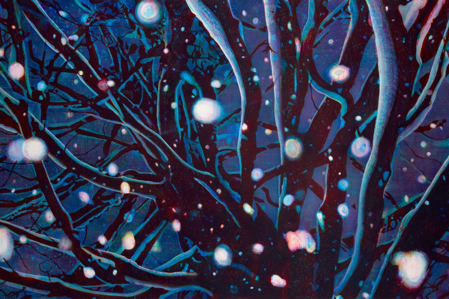
The Kinglake works introduce elements such as falling ash, which, like the cascading snow in your wintry paintings, bring another optical layer to the image. How do these motifs operate for you?

It was an extension of my fascination with the luminous quality of the digital screen. I was making images on screen, printing them large, but there’s always some loss. Printing onto backlit screens maximised that luminosity.

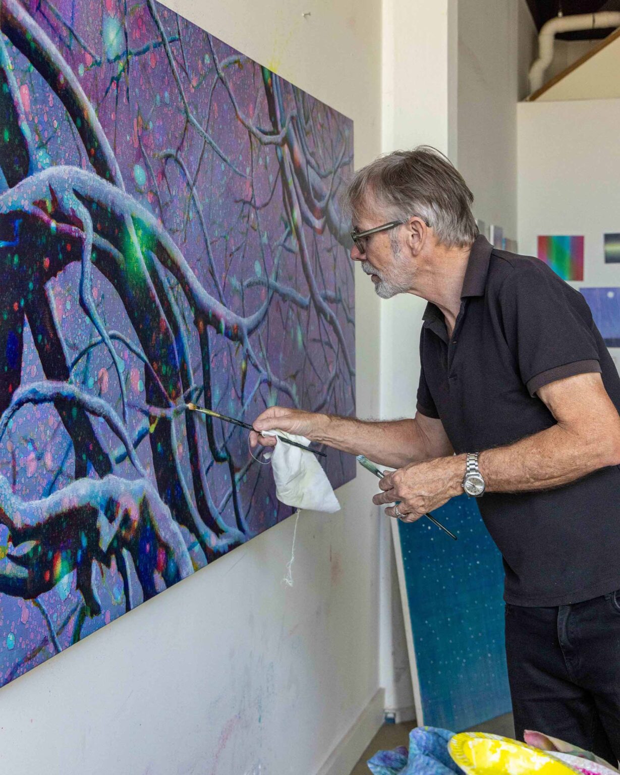
More recently, I revisited canvases of falling snow. I superimposed imagery from the Kinglake photographs – trees and branches – in a way that integrated the snowflakes into the space. The juxtaposition of burnt bush and snow gave the works a strange quality. In paintings where I’d used colour separation, the red, green, and blue snowflakes looked like flying embers or spirits – something ghostly or magical. They refract light, almost like prisms, and can act like little lenses that reveal the forms behind them.

You divide your time between rural France and Australia. How does that movement shape the work?

People in Australia say my work feels European, and people in Europe say it feels Australian. So I’m somewhere in between. I might work on a painting in one studio and finish it in the other, and it looks completely different. The light does have an effect – you see things differently. You adjust, you accommodate.

But I’ve never really consciously thought, “That’s a European thing, that’s an Australian thing.” The gestation period is so long that when I’m in France, I’m probably working on ideas that I came up with in Australia, or even on the previous trip to Australia, and vice versa. Everything gets mixed together.

Images float around on my computer for years, get recycled, accumulate. They’re just ingredients. They become disassociated from their origins. With the Dutch still-life material, people ask, “What painting is that from?” I have absolutely no idea.

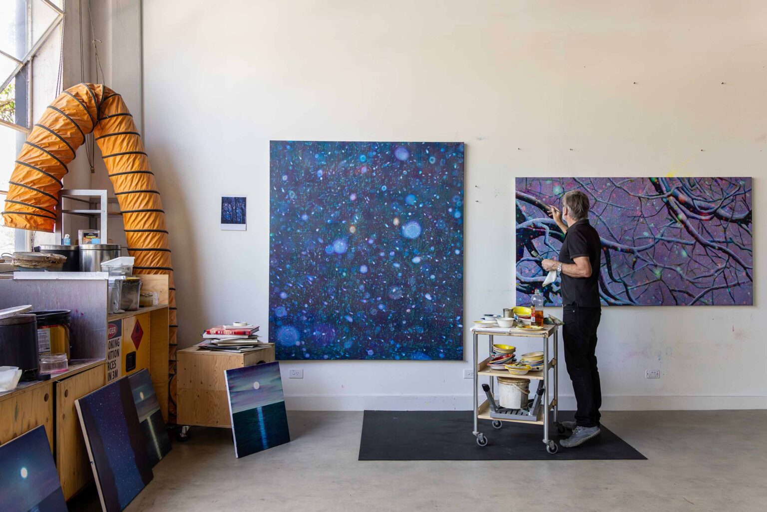
Could you tell us about what you’re working on and what feels most generative in the studio at the moment?

I’m still working with colour separation, but the very large figurative Dutch master imagery has become less central. There’s a body of work that began with digital prints. I used dice to determine which drawing was used for which colour, orientation, positive or negative. With those works, it’s about randomness – letting go of control.

It takes me back to printmaking, back to the press, back to ink. You try to make one image and end up with twenty variations. The variations become the interesting thing.
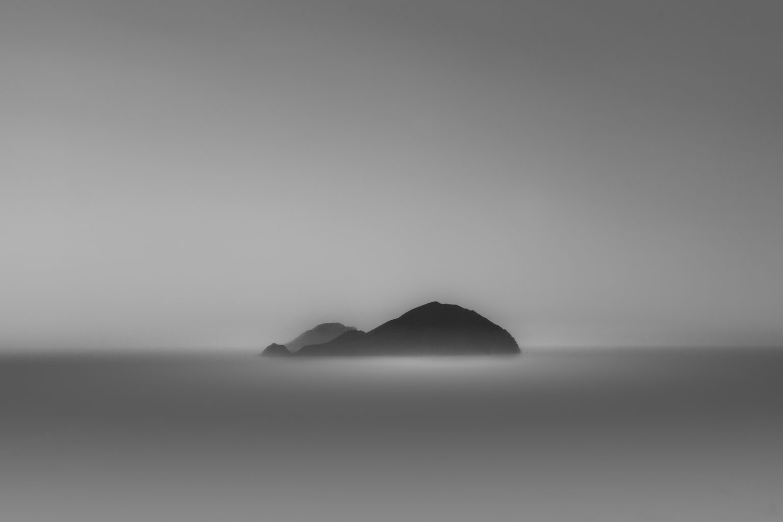
I’m also working on very simple little landscapes. Change the amount of yellow, change the sky – you could make a thousand and they’d all be different. The base forms feel universal. Like Sugimoto’s horizons – images we feel we’ve always known.
I enjoy that fulcrum between abstraction and representation – between chance and recognition. I don’t quite know how it works, but it does.

Farewell Series

Posted by

Holly O’Meehan

Posted by

Holly O’Meehan

  • Artist
    Holly O’Meehan
  • Dates
    5—28 Mar 2026
  • Gallery Location
    Berlin

In March, the gallery will present the first German exhibition by Western Australia–born, Berlin-based ceramic artist Holly O’Meehan.

Kristin Schnell | Artist Profile

Posted by

Kristin Schnell | Artist Profile

  • Artist
    Kristin Schnell
  • Dates
    21 Jan—27 Feb 2026
  • Gallery Location
    Berlin

In the lead-up to our first solo exhibition from Kristin Schnell, Of Cages and Feathers – and ahead of our opening celebration at the gallery on Saturday, 24 January, where the artist will be on hand to offer insight into her works – the Michael Reid team sat down with the German-born, Baltic Sea-based artist to discuss the ideas, inspirations, creative approach and environmental themes that inform her vibrant photographic practice.

“The exhibition brings together several bodies of work that revolve around the same central questions: freedom and constraint, care and control, and the complex emotional space between humans and animals,” says Schnell, who recently exhibited her work Son and Father in Sydney as a finalist in the prestigious Head On Photo Awards. “My bird models are originally from Australia. Colonial trade carried their ancestors to Europe, and generations have lived behind bars, far from their natural habitats,” she notes. “With the Head On Festival exhibition, they return home – at least visually – and that makes me very happy.”

Read our interview with Kristin Schnell below. Of Cages and Feathers is on view at Michael Reid Berlin until Saturday, 28 February, and all works can be explored and acquired online, at the gallery and by request.

For enquiries, please email colinesoria@michaelreid.com.au

How did your career begin, and what key moments or decisions shaped your path as an artist?


My artistic career began relatively late and very consciously. In 2020, I decided to focus seriously on photography as an artistic practice and joined a LensCulture Masterclass in Amsterdam. That experience was a turning point – it helped me understand photography not just as an image, but as a language for thinking and questioning the world.

A key decision was to work long-term on a single subject instead of moving quickly from project to project. My ongoing work with birds became a way to explore themes of freedom, control, vulnerability, and the complex relationship between humans and nature. Building my own visual world – rather than responding to trends or expectations – was essential.

Another important moment was realising that artistic development requires patience and investment. The first years were not financially easy, but exhibitions, publications, and the growing international dialogue around my work confirmed that this path was the right one.

Looking back, the most formative choices were committing fully to the work, allowing it to evolve slowly, and trusting that depth and consistency would eventually find their audience.

Can you describe your working process, from the initial idea to the final image?


My working process usually begins with an idea or a question rather than a fixed image. I’m interested in states of tension – between freedom and control, nature and construction, intimacy and distance. From there, I start building a visual situation rather than staging a narrative.

I work with carefully composed sets, colours, and geometric elements that create a kind of framework or stage. Within this constructed environment, chance plays an important role. The birds I photograph are never directed; their movements, pauses, and interactions introduce unpredictability and presence. I’m attentive to light, timing, and small shifts, allowing the image to emerge rather than forcing it.

The final image is the result of this balance between control and openness. I edit very carefully, choosing photographs that retain a sense of ambiguity – images that don’t explain themselves fully, but leave space for viewers to bring in their own emotions and interpretations.

What draws you to working with animals, particularly birds, as central subjects in your photographs?


I’m drawn to working with animals, and especially birds, because they exist at a powerful intersection of beauty, vulnerability, and symbolism. Birds are often associated with freedom, yet many live in conditions shaped or controlled by humans. That contradiction reflects broader questions about autonomy, care, and responsibility.

Working with birds allows me to speak about human conditions without directly depicting people. They become stand-ins through which themes of longing, confinement, tenderness, and projection can surface. At the same time, they remain fully themselves – unpredictable, present, and resistant to narrative.

Their presence introduces a form of truth into the image. No matter how carefully a scene is constructed, the animal cannot be fully controlled, and that tension is central to my work.

What have been some of your favourite career experiences?


Some of my favourite experiences have been moments when the work moved beyond the studio and entered a real dialogue with others. Seeing my photographs included in museum and institutional contexts was deeply affirming – not as validation, but as a sign that the work could hold meaning beyond my own intentions.

The publication of my first book, Of Cages and Feathers, was another important experience. Working closely with an editor and seeing the project take shape as a physical object clarified the long-term nature of my practice and how individual images relate to one another.

Equally meaningful have been conversations – with curators, editors, and viewers – where unexpected interpretations emerged. Those moments, when the work begins to live independently and provoke thought or emotion, are often more memorable to me than any single event.

What ideas and experiences have informed your more recent work?


My more recent work has been shaped by a growing awareness of responsibility – towards the animals I work with, toward the images I create, and toward the narratives they may generate. Over time, my focus has shifted from making single, resolved images to thinking more about relationships: between humans and animals, control and care, presence and absence.

Personal experiences have also deepened this shift. Living closely with animals has made me more attentive to subtle forms of communication, to trust, and to the ethics of proximity. I’m increasingly interested in moments that feel quiet or unresolved, where meaning emerges through restraint rather than spectacle.

At the same time, my work has become more open formally. I allow more space for chance, fragility, and imperfection – seeing these not as weaknesses, but as essential elements that mirror the complexity of the world we inhabit.

What questions are you most interested in exploring through your practice right now?


Right now, I’m most interested in questions around care, power, and responsibility – particularly in the relationships between humans and animals. I’m exploring how acts of protection can also become forms of control, and where the line lies between care and domination.

I’m also thinking a lot about projection: how humans assign meaning, emotion, and symbolism to animals, and what that reveals about ourselves. Working with birds allows me to approach these questions indirectly, through presence and gesture rather than narrative.

More broadly, I’m interested in how images can hold complexity without offering clear answers – how photography can create spaces for reflection rather than conclusion, and invite viewers into a more attentive way of looking

Can you tell us more about the works presented in this exhibition?


The works presented in this exhibition bring together several bodies of work that revolve around the same central questions: freedom and constraint, care and control, and the complex emotional space between humans and animals.

The photographs are carefully composed, often using strong colours and geometric elements to create a constructed environment. Within these settings, birds appear as living presences rather than symbols to be decoded. Their movements, stillness, and interactions introduce chance and vulnerability, subtly shifting the meaning of each image.

Some works feel more intimate and quiet, others more theatrical, but all share an interest in ambiguity. Rather than offering a single narrative, the exhibition invites viewers to move between images and form their own connections  – allowing the works to resonate on both an emotional and reflective level.

Tali Ngura Wiru – Beautiful Sandhill Country

Posted by

Tali Ngura Wiru – Beautiful Sandhill Country

  • Artist
    Priscilla Singer and Trisha Singer
  • Dates
    5—21 Feb 2026
  • Gallery Location
    Eora / Sydney

In February, our Eora/Sydney gallery’s upstairs exhibition space will host a joint exhibition by sisters Priscilla Singer and Trisha Singer – two celebrated Iwantja artists whose first Michael Reid Sydney showing will continue throughout next month, coinciding with a large-scale solo exhibition by their Iwantja Arts peer Raylene Walatinna in our ground-floor gallery. Together, these presentations attest to a powerful, intergenerational dialogue grounded in Country, kinship and the living continuity of Aṉangu cultural practice, while reflecting the verve and vibrancy that has powered Iwantja’s exuberant, world-significant new movement in contemporary First Nations painting over the past four decades.

Since its founding in the early 1980s, Iwantja Arts has played a vital role in championing Aṉangu land rights, self-determination, language and cultural expression – a legacy inseparable from the work of Priscilla and Trisha’s mother, the late artist Kunmanara (Sadie) Singer, who co-founded Iwantja Arts alongside Alec Baker. A revered artist, cultural leader and advocate, Sadie Singer’s influence continues to resonate through the practices of her daughters.

Anchoring the sisters’ joint exhibition, Tali Ngura Wiru – Beautiful Sandhill Country, are two newly completed, large-scale diptychs – one by each artist – conceived as twin pillars around which a constellation of vibrant canvases will circulate. Together, these works trace a shared geography while allowing space for individual cadence, colour and mark-making to emerge.

“I’ve been making art since I was a young girl,” says Trisha Singer, who paints Tali Ngura – sandhill Country – on Yankunytjatjara land. “You can see sandhills in the colours I use, desert colours, with dusty reds and oranges. I paint the important places that I know well, that my mother shared with me. There’s a lot of my mum in my work – what she liked and what she taught me. I like looking at different flowers, and going on Country and getting the knowledge of the land, and the story, passed on from grandparents … When you travel, you see the changes in the land. It comes alive.”

For Priscilla Singer, a senior Pitjantjatjara woman and longstanding leader within the Iwantja community, painting is an act of remembrance, transmission and care. “When I’m painting, I always think about my grandfather’s Country and my mother’s painting. I try to paint the places they travelled around,” she says. “I look to my mum’s painting and show some of that same story in my work. I paint the red sand. The red sand never changes; it is always here. When the sun sets, you can see the glow of the earth. I paint this country so people can see my land, they can appreciate its beauty and understand its power.”

Family, language and collective strength sit at the heart of both sisters’ artistic practices. “Family and community are so important to Aṉangu culture,” says Priscilla Singer, who previously exhibited her work to great acclaim in the 2025 Michael Reid Southern Highlands group show Ngura Pilunpa – Peaceful Country. “Our connection to each other and to our Country informs everything we do, especially making art and passing on culture to our younger generations. Being together makes us strong.”

All works from Tali Ngura Wiru – Beautiful Sandhill Country by Priscilla Singer and Trisha Singer can be previewed and acquired by request in the lead-up to the opening. Please email hughholm@michaelreid.com.au

2026 Exhibition Program Highlights at Michael Reid Sydney + Berlin

Posted by

2026 Exhibition Program Highlights at Michael Reid Sydney + Berlin

Michael Reid Sydney + Berlin is pleased to share selected highlights from our 2026 exhibitions program and invite collectors to sign up for exclusive previews and priority access to these and other projects set to light up next year’s culture calendar. This dynamic slate encompasses new and ambitious bodies of work from many of the most acclaimed, in-demand and directional voices in Australian contemporary art.

We look forward to presenting these artists’ forthcoming projects at our Eora/Sydney and Berlin galleries – as well as with our second foray into the United States – across a packed year ahead. To discuss our forthcoming program with a gallery representative, please contact danielsoma@michaelreid.com.au or dean@michaelreid.com.au


John Honeywill

Posted by

John Honeywill

  • Artist
    John Honeywill
  • Dates
    6 Aug—5 Sep 2026
  • Gallery Location
    Eora / Sydney

Celebrated Meanjin/Brisbane-based contemporary painter and master of the still life John Honeywill returns to Michael Reid Sydney in August for his first solo exhibition in more than two years. Brought to life with meticulous precision and masterly control of light and mood, Honeywill’s paintings set everyday objects within deceptively simple compositions that appear quietly radiant and seemingly lit from within.

His acclaimed practice is propelled by a curious, almost ineffable affinity for the objects of his gaze – unsentimental yet emotionally resonant subjects that draw the eye with the quiet authority of their presence. From sugary sweets to elegant vessels enclosing fruit or delicately unfolding flowers, these still-life elements exude a serene stillness and subtle alchemy as they coalesce and converse in graceful, mesmerising arrangements.

By suspending these objects against ambiguous, softly luminescent planes – at times subtly reflective, at others gauze-like and atmospheric – and rendering them with astonishing, ultra-precise detail, Honeywill heightens their sense of poise and intimacy. His paintings stand as a paean to the interplay between an object’s presence and the artist’s perception – the organising idea behind his 2023 monograph, Presence and Perception.

To sign up for first access to the artist’s forthcoming series, please email dean@michaelreid.com.au

Aotearoa Art Fair 2026

Posted by

Aotearoa Art Fair 2026

  • Artist
    Scott Perkins
  • Dates
    30 Apr—3 May 2026
  • Gallery Location
    Aotearoa Art Fair, Auckland

Michael Reid Sydney + Berlin will travel to Auckland in April for the 2026 edition of the Aotearoa Art Fair, taking visitors inside the atmospheric worlds of New Zealand-born, Australia-based contemporary photographer Scott Perkins.

Distilling the landscape into a kind of minimalist visual poetry, Perkins’s abstracted nature scenes are imbued with mood and luminosity. Brooding forests and sweeping seascapes are pared back to elemental gestures: graduated horizons, silhouetted escarpments and silvery skies that shimmer with the granular glint of celestial dust.

Housed within bespoke architectural timber frames and softly glowing light boxes, these works hover between object and image, functioning as much as sculptures in the round as photographs. Having joined our stable of represented artists in 2025, soon after his widely acclaimed solo exhibition Uncertain Truths, Perkins has refined a singular practice that opens meditative thresholds through which unknowable yet intimately compelling places emerge, at once familiar and strange.

To sign up for first access to works from Scott Perkins’s Aotearoa Art Fair presentation, please email dean@michaelreid.com.au

R.M.Williams x Michael Reid Murrurundi – Between Dust & Rain

Posted by

R.M.Williams x Michael Reid Murrurundi – Between Dust & Rain

Stacey McCall

Posted by

Stacey McCall

  • Artist
    Stacey McCall
  • Dates
    2 Apr—16 May 2026
  • Gallery Location
    Berlin

Michael Reid Berlin will usher in the European spring with the first international solo exhibition from Naarm/Melbourne-based contemporary painter and celebrated stalwart of our Murrurundi gallery Stacey McCall. The culmination of an extended artist residency in Paris, McCall’s upcoming series will build on the glittering success of her most recent Murrurundi show, Lucent, which similarly emerged from the sketchbooks she kept during a sojourn in the City of Light.

Titled after the gorgeous, gauzy glow that washes through each picture and lights up her elegant, effortlessly arranged accoutrements and tableware, Lucent found McCall honing her softly expressive painterly language rooted in tonal underpainting. Evoking the essence of her still-life objects with an economy of graceful gestures and pared-back textural markings that filter through clouds of earthy, peachy tones, McCall’s deceptively simple, deftly realised style feels perfectly attuned to the warm insouciance and easy eclecticism of a Parisian pied-à-terre.

With her distinctive and richly evocative approach to still life, McCall allows the cumulative impact of timeworn objects and artfully undone florals and fruit to conjure a familiar yet faraway mood.

To sign up for first access to works from Stacey McCall’s first solo exhibition at Michael Reid Berlin, please email colinesoria@michaelreid.com.au

Join our mailing list
Interests(Required)
REGISTER YOUR INTEREST: The Christmas Tree Bucket
This field is hidden when viewing the form
Artist
This field is hidden when viewing the form
Centres
This field is hidden when viewing the form
Interests